
Each year, paint brands unveil their Paint Colours of the Year, hues that set the tone for design trends across interiors, fashion, and even product design. As an interior designer, I always look beyond the marketing gloss to ask: what do these colours say about where design is headed?
For 2026, we’re seeing a rich story unfold, one of depth, warmth, and self-expression. Here’s my take on the standout colours from Benjamin Moore, Dulux, Lick, Farrow & Ball, and Fenwick & Tilbrook, and how to bring them into your own home.
Table of Contents
Benjamin Moore: Silhouette AF-655: The Power of Poise
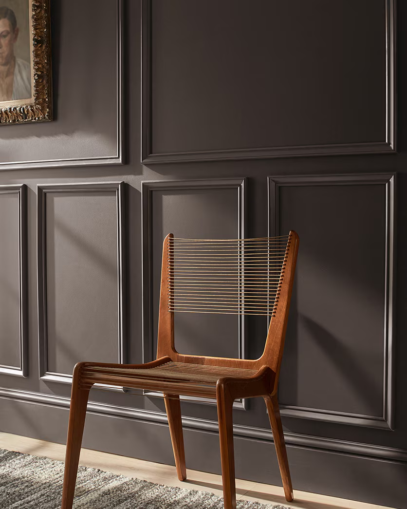
Benjamin Moore’s Colour of the Year 2026, Silhouette AF-655, is a masterclass in quiet sophistication: a deep espresso-meets-charcoal tone that evokes tailored elegance. It’s moody but not cold, dramatic yet versatile.
Why it works
- Timeless neutrality: It straddles brown, black, and grey, a grounding hue for any palette.
- Layered luxury: Pair with warm woods, brass accents, or creamy whites for balance.
- Design direction: This marks a shift away from airy pastels toward richer, more enveloping interiors.
Designer tip
Use Silhouette on walls, cabinetry, or even interior doors. In dim light, it creates instant intimacy; in bright spaces, it feels chic and sculptural.
Dulux: Rhythm of Blues: Calm Meets Creativity
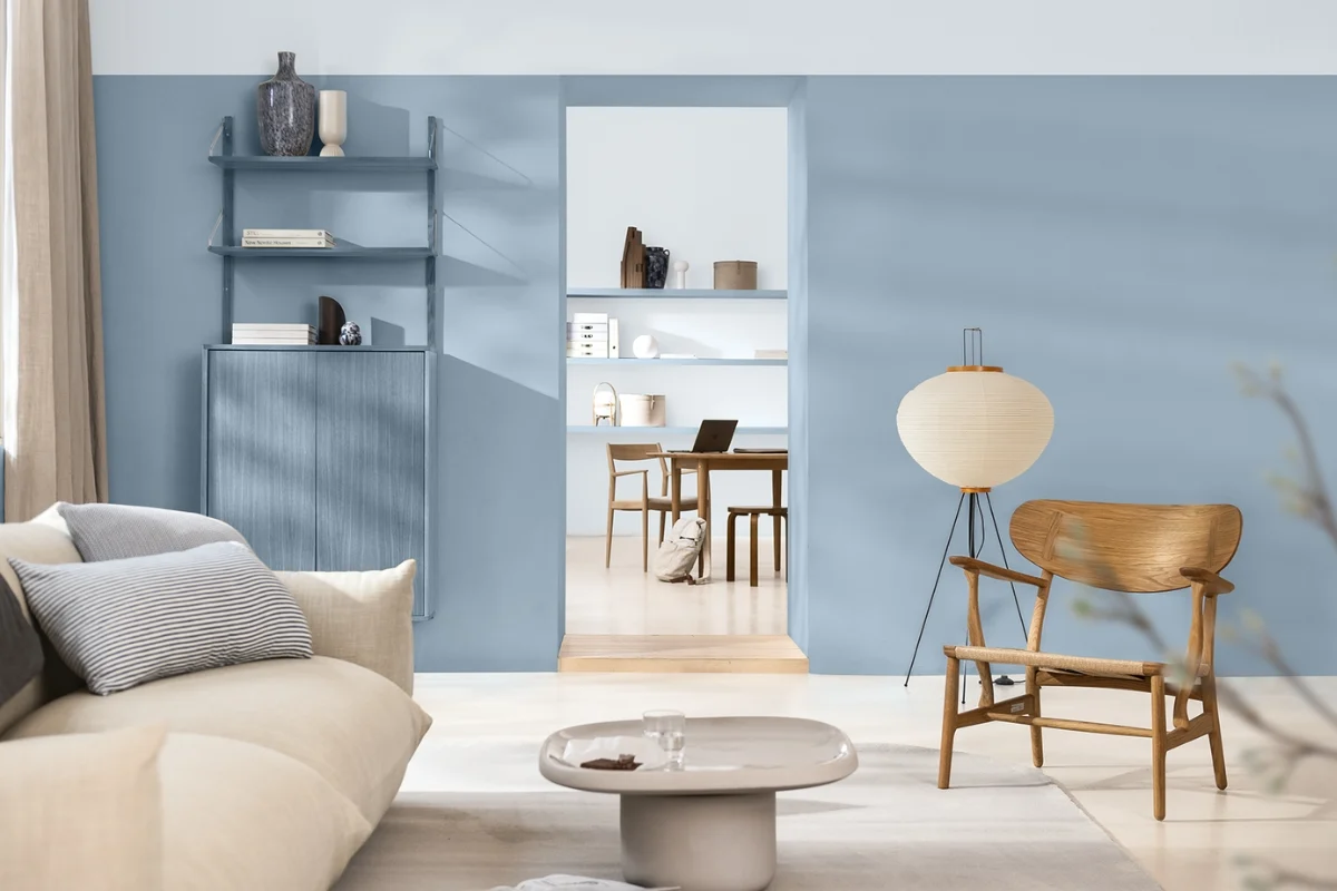
For 2026, Dulux broke tradition by announcing a trio of blues – Mellow Flow, Slow Swing, and Free Groove – under the theme “Rhythm of Blues”.
Why it matters
This collection of paint colours celebrates individuality. Rather than one trend colour, Dulux gives us a mood range, from soft and soothing to rich and soulful.
How to use them
- Mellow Flow: a misty blue perfect for bedrooms or bathrooms.
- Slow Swing: a deeper, velvety navy ideal for libraries or dining rooms.
- Free Groove: a playful, medium-toned blue that sings in kitchens or hallways.
Together, they bring harmony and flexibility, exactly what our homes need right now.
Lick: Return to Play, A Joyful Colour Edit
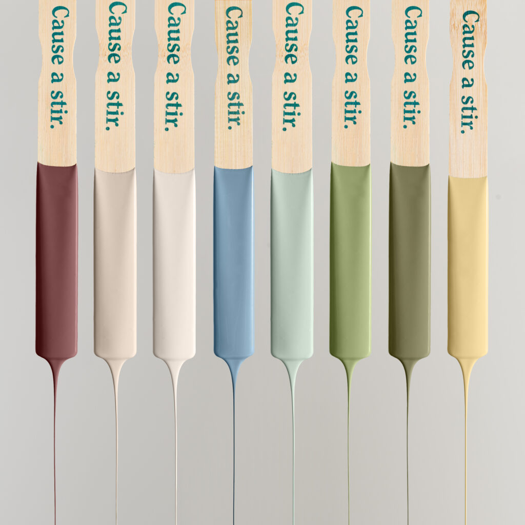
Lick takes a different approach to paint colours of the year. Instead of a single “it” shade, their Colour Edit 2026, Return to Play, presents a palette of eight uplifting tones, from matcha Green 18 to buttery Yellow 07 and joyful Red 06.
The message
Homes are becoming more expressive again. After years of beige minimalism, we’re seeing colour as therapy, a way to reconnect with joy, creativity, and nostalgia.
Styling ideas
- Pair Green 18 cabinetry with creamy off-whites for a fresh, natural kitchen.
- Use Red 06 in small doses, a front door, a statement chair, or artwork accent.
- Mix Yellow 07 with neutrals to bring subtle warmth without overpowering.
This palette encourages you to play, and that’s exactly the point.
Farrow & Ball: Heritage with Heart
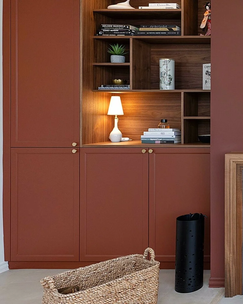
Farrow & Ball don’t chase trends. Instead, their 2025–2026 releases revisit historic hues like Broccoli Brown, Etruscan Red, and Sap Green, rich, grounded tones inspired by heritage pigments.
Designer insight
This move speaks to longevity. Clients are seeking colours with story and soul, not fleeting fashion. These hues pair beautifully with traditional mouldings, natural textiles, and aged brass fixtures.
How to use them
- Broccoli Brown: stunning in studies or dens for a cocooning effect.
- Etruscan Red: dramatic yet timeless in dining spaces.
- Sap Green: serene for bedrooms or conservatories.
Each shade whispers refinement rather than shouting trend.
Fenwick & Tilbrook: Subtle Sophistication
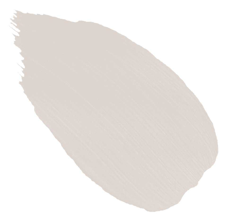
While this boutique British brand doesn’t officially name a “Colour of the Year”, Smudgewand, a soft, pink-toned neutral, has quietly become a designer favourite.
Why it stands out
Its gentle warmth flatters natural light and complements both traditional and modern interiors. Perfect for bedrooms, dressing rooms, or calm living spaces.
Designer tip
Pair Smudgewand with warm whites, antique brass, or muted greens for a contemporary yet timeless look.
Little Greene: Adventurer — Deep, Confident, and Comforting
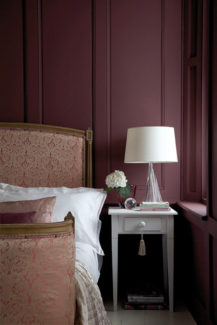
Little Greene’s Colour of the Year 2026, Adventurer, is a luxurious plum-aubergine that instantly adds drama and depth to any space. It’s a confident, cocooning hue, the kind of colour that feels equally at home in a chic city apartment or a cosy country cottage.
Why it works
“Adventurer” represents a growing appetite for warmth and richness in interiors. After years of greys and minimalist whites, homeowners are craving colour that feels comforting yet bold.
Ruth Mottershead, Creative Director at Little Greene, describes it as “regal yet reassuring, a reflection of the newfound colour confidence in our homes.”
This deep tone celebrates individuality; it’s expressive, elegant, and timeless all at once.
The Bigger Picture: What 2026’s Colours Tell Us
Across all brands, a few clear themes emerge:
- Depth & warmth: We’re leaving behind sterile greys in favour of richer, moodier neutrals.
- Emotional colour: Palettes now reflect how we want to feel – grounded, joyful, and soothed.
- Heritage revival: Timeless hues from archives are back, giving rooms story and texture.
- Personal expression: Whether through a single bold tone or a custom palette, colour is now a language of individuality.
Bringing It Home
When working with clients, I always remind them:
“A colour trend is just a conversation starter; your home tells the rest of the story.”
Whether you embrace the quiet drama of Silhouette, the serenity of Dulux’s blues, or the optimism of Lick’s playful palette, the real art lies in making it yours.
Sample generously, observe under changing light, and don’t be afraid to blend warmth and depth. 2026 is the year to design with confidence and a little bit of soul.