It can be pretty daunting when choosing a color palette; the 60-30-10 color rule is a foundational principle in interior design that helps create a balanced and visually appealing color palette for any space.

Table of Contents
How the 60-30-10 Rule Works
Applying the 60-30-10 rule is really easy, here’s how it works.
60% of the space should be dominated by a primary colour. This usually includes the largest surfaces, like walls, large furniture, or flooring.
30% of the space should feature a secondary color. We can incorporate this in upholstery, curtains, or accent walls.
10% of the space should include an accent colour. This can be used in accessories like pillows, art, or decorative objects.
Creative Ideas to Better Understand and Apply The 60-30-10 Rule
Monochromatic magic! Sticking to just one color while playing with different shades using the 60-30-10 rule creates a beautifully balanced yet dramatic effect. It’s perfect for color drenching! Here, 60% of the room—walls, ceiling, skirting boards, architraves, and window frames—are painted in a soft light blue, giving the space a bright, airy feel. The next 30% brings in a bold, deep blue through the sofa, table, chairs, and artwork, adding depth and contrast. Finally, the last 10% comes in with a dusky blue on the lampshades and cupboard, softening the look and tying everything together for a harmonious, stylish finish.

Source: wayfair.com
Achromatic 60-30-10 Rule
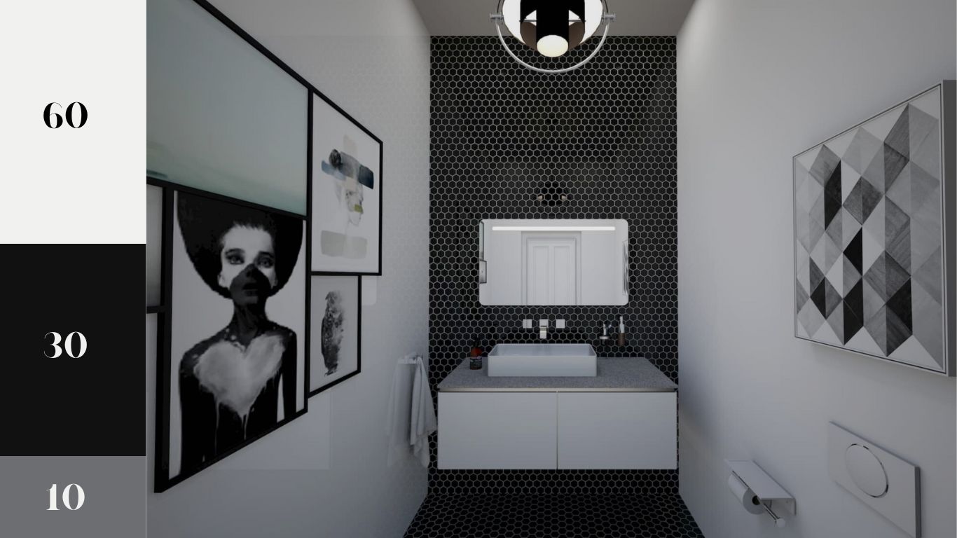
Achromatic black, white, and grey; classic, timeless, and effortlessly bold! In this bathroom, a soft off white covers 60% of the space, from the walls to the countertop and artwork, creating a clean and airy feel. The striking black tiles and bold accents in the artwork make up 30%, adding depth and contrast. Finally, the last 10% comes through in dark grey details within the artwork, subtly tying everything together for a sleek and stylish finish.

Source: latelierkauldhar.com
Complementary 60-30-10 Rule
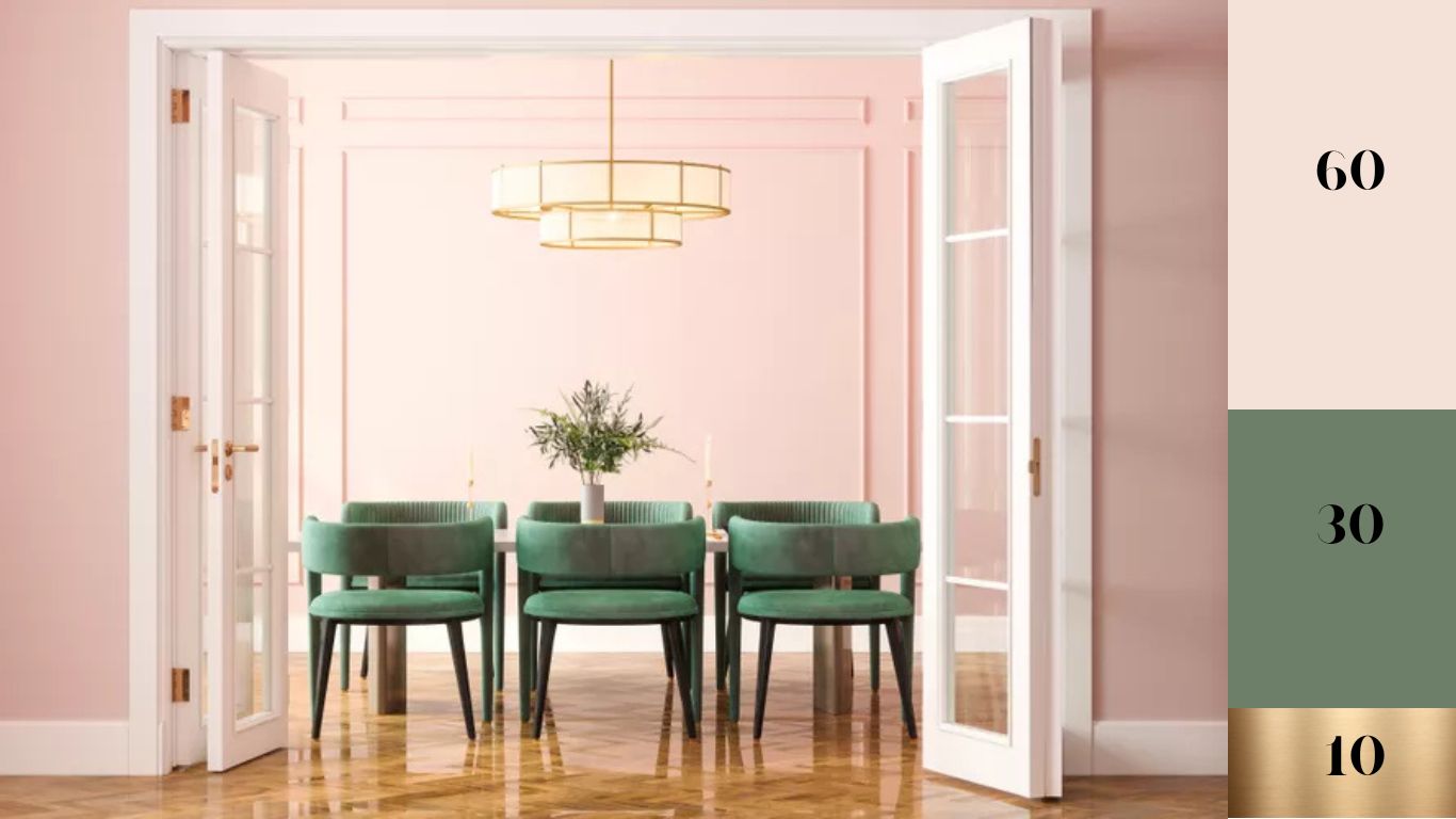
This dining room is a perfect example of simple yet stunning design! The complementary color scheme of pink and green is effortlessly chic, with a touch of gold for added elegance. A soft, rosy pink covers 60% of the space, wrapping the walls in warmth. The stylish green chairs provide a striking 30% contrast, bringing a fresh and sophisticated balance. Finally, the last 10% comes from the elegant gold accents in the lampshade and candle holders, adding just the right amount of glamour.

Source: marthastewart.com
Analogous 60-30-10 Rule
A striking way to put the rule into practice. This really enables us to experiment with color. This approach makes experimenting with color so much fun. Here, 60% of the room is a bold, vibrant blue, covering the walls and rug, creating a strong foundation. Then, 30% brings in a rich green with the sofa, adding contrast and depth. Finally, the last 10% comes in with pops of purple, making a subtle yet striking statement.

Source: James Merrell
Triadic 60-30-10 Rule
This might just be one of the most stunning and creative ways to use color! A bold take on the rule, this scheme brings together a striking trio of blue, pink, and yellow. The blue covers 60% of the space, blanketing the walls in a bright blue wallpaper and tying in with a matching cushion. A bold fuchsia pink headboard adds a vibrant 30%, creating a gorgeous contrast. Finally, the last 10% comes from cheerful yellow accents in the lamp and cushion, adding just the right pop of warmth and energy.

Source: interiordesignwhangarei.nz
Neutral 60-30-10 Rule
Maximize light and create a soothing space that invites you to relax and unwind. This cozy living room keeps things calm and airy with 60% off-white on the walls, mantel, and side table. A soft wheat tone makes up 30% of the scheme, adding warmth through a bold, wide stripe around the center of the walls and a plush armchair. Finally, a grey cushion and throw add the last 10%, bringing a subtle contrast for a perfectly balanced, neutral look.

Source: thebritishblanketcompany.com
Split complementary at its finest! This bold and luxurious color scheme brings warmth and elegance with a vibrant apricot orange covering 60% of the space. A deep, rich blue on the tiles and countertop adds a striking 30% contrast, creating depth and drama. The final 10% comes from glamorous gold accents—mirrors, lights, taps, stools, and rails—tying everything together with a touch of sophistication.

Source: thouswell.com
The 60-30-10 color rule is a timeless and effective guideline for achieving a harmonious and balanced interior design. This principle is versatile and works across all design styles, from modern minimalism to traditional elegance.
Experimenting with this rule using mood boards, digital tools, and real-life applications will help you confidently apply it to your own spaces, transforming your home into a stylish and inviting sanctuary.
