
Knowing how to mix patterns can feel like an intimidating art form; one wrong move and suddenly your chic vision has spiralled into an eccentric auntie with a lifelong love affair with paisley. But here’s the good news: pattern play isn’t about luck or guesswork; it’s about balance and a little bit of planning.
This guide will walk you through foolproof steps for pairing prints, colours, and textures in your home, with plenty of easy tricks to help you create harmony instead of havoc.
So, let’s get bold, shake things up, and design spaces that are nothing short of stunning. Keep reading; your inner pattern-mixing pro is about to emerge.
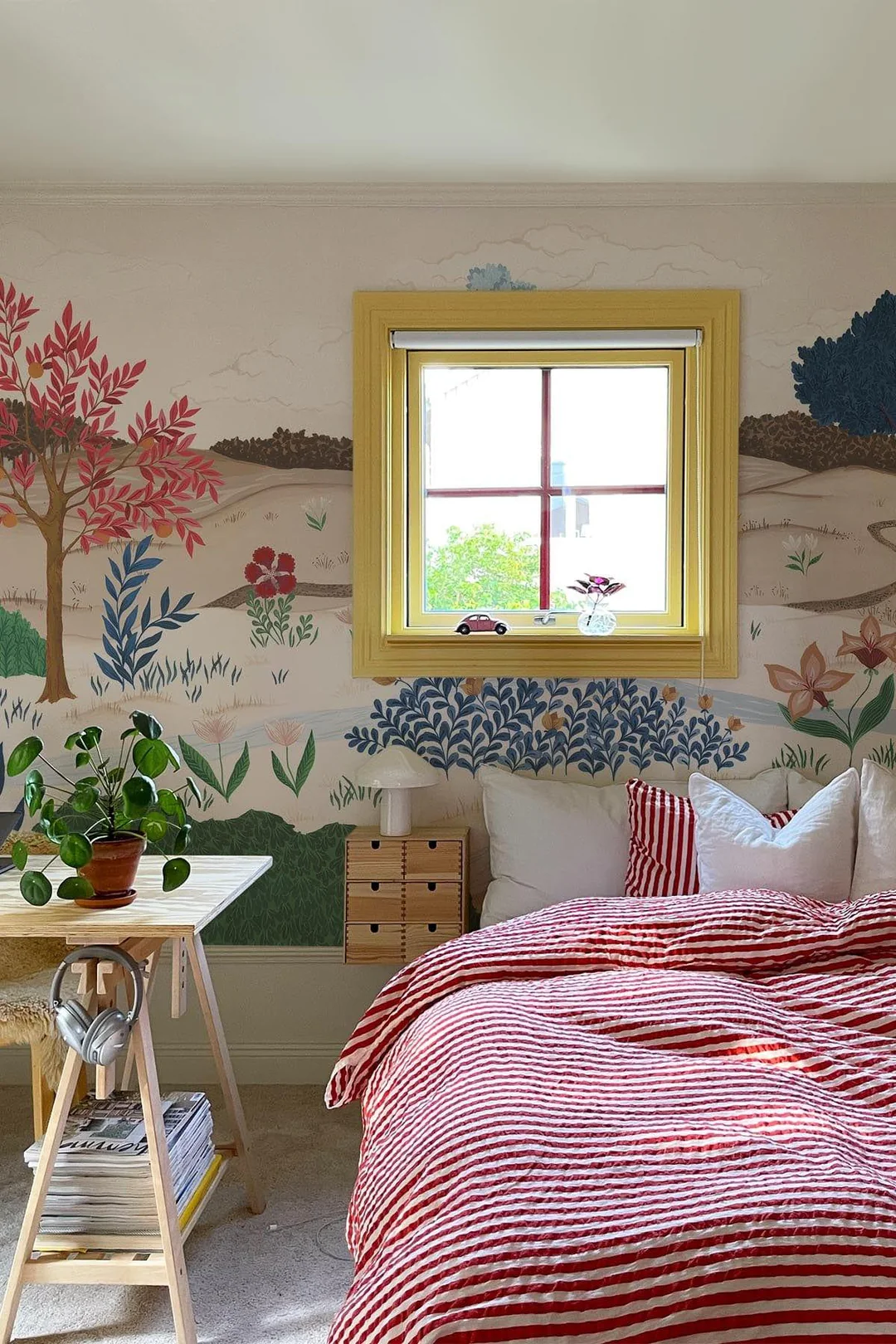
Table of Contents
The Importance of Scale in Pattern Mixing
Scale matters a lot in pattern mixing. Large, medium, and small patterns can work well together if you choose wisely.

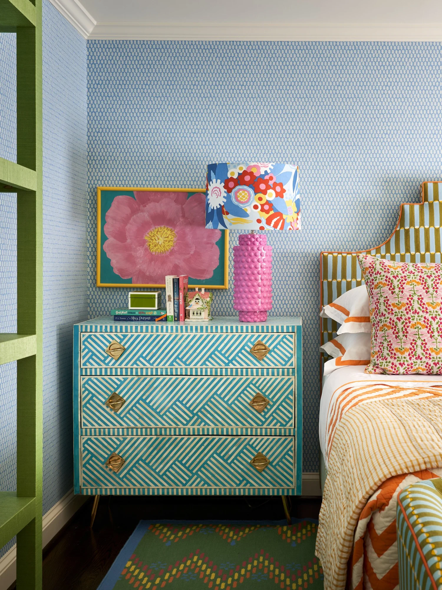
Large-scale patterns
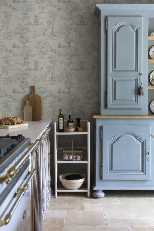
Large-scale patterns bring a bold touch to any space. Think of big florals, wide stripes, or large geometric shapes. These designs catch the eye first because they have more visual weight.
In interior design, use one main large print as your focus piece; a sofa with oversized flowers or curtains with broad stripes works well.
Balance is key for style blending and pattern coordination. Pairing these dominant patterns with smaller prints can keep things intriguing without feeling too busy. Stick to color harmony so the look feels pulled together and not random.
Use scale mixing wisely; too many big prints in one place can make the room feel crowded instead of cosy and inviting.
Medium-scale patterns
Medium-scale patterns fit right in between bold, large prints and tiny motifs. They work well for pattern coordination, bringing visual balance to your interior design combinations.
Classic polka dots, medium florals, and checkered textiles are common examples. These patterns feel less dramatic than big designs but stand out more than small ones. Designers often use them on accent pillows or curtains for home decor, because they blend easily with both larger and smaller scales.
Try mixing a medium striped throw blanket with oversized floral bedding. You get style blending without making the room feel too busy. Medium-scale prints help tie different fabric selections together while keeping color harmony strong in your space.
Pattern scale can make or break a room’s vibe.
Small-scale patterns
Small-scale patterns create visual texture in home decor and interior design. Think of polka dots, tiny checks, or subtle herringbone prints. These motifs often work well on textiles like throw pillows, lampshades, or even small accent chairs.
They add balance when you mix them with larger prints. Small designs tend to read as a solid color from far away but give extra interest up close.
Using several small-scale motifs together can look busy if the colours clash. Pick a color palette that fits your style; this helps keep pattern coordination simple and adds visual harmony to your space.
Small-scale prints help soften bold patterns and bring style blending into any room without much fuss.
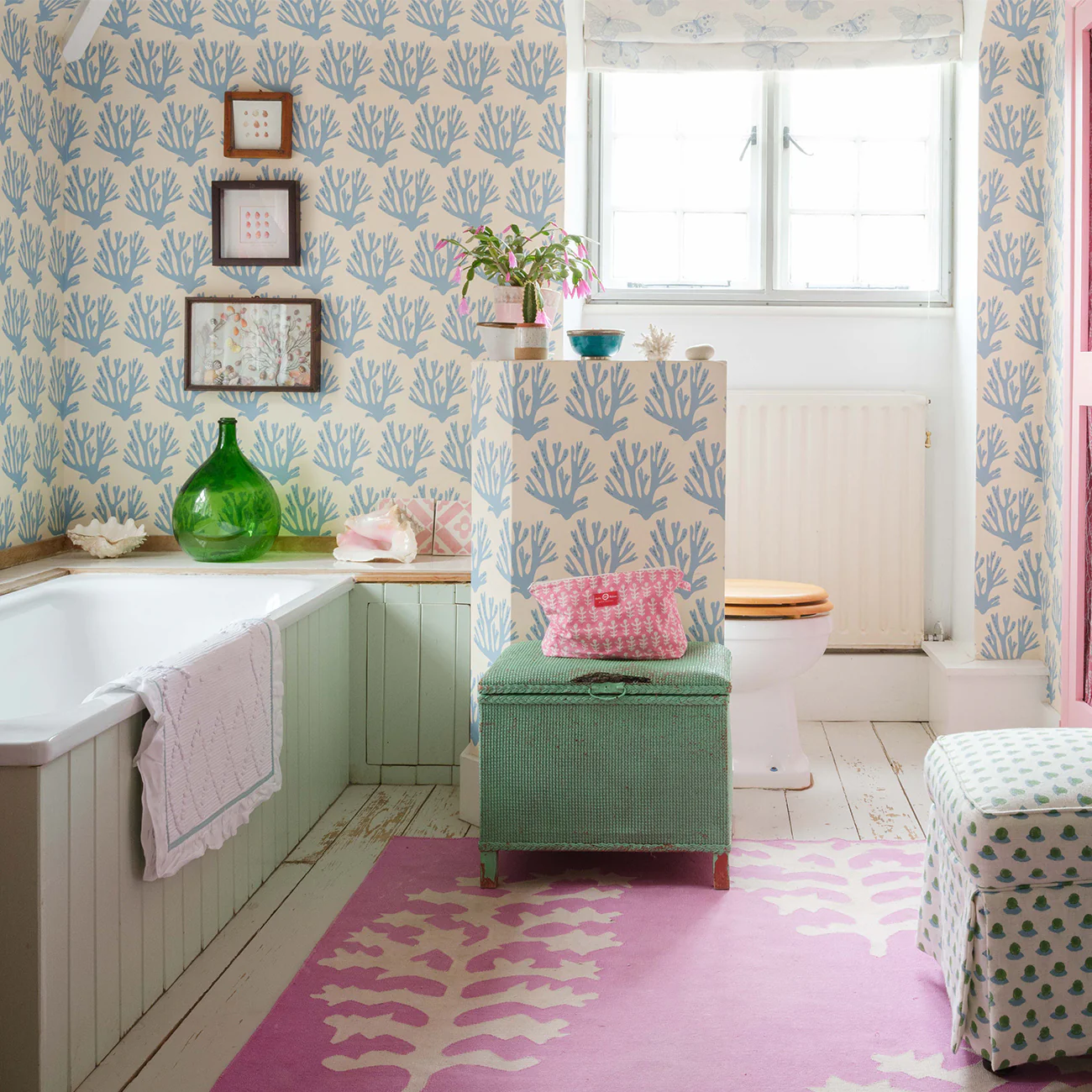
Choosing a Cohesive Color Palette
Pick colours that play nicely together. Think shades that mingle rather than wrestle for attention, because nobody wants a living room that looks like a crayon fight. This is where those primary school art lessons suddenly feel worth the glitter glue. My advice would be to get cosy with your colour wheel and master the 60-30-10 rule. It’s the cheat sheet designers swear by, and it’ll make your space look effortlessly pulled together (with zero finger painting required).
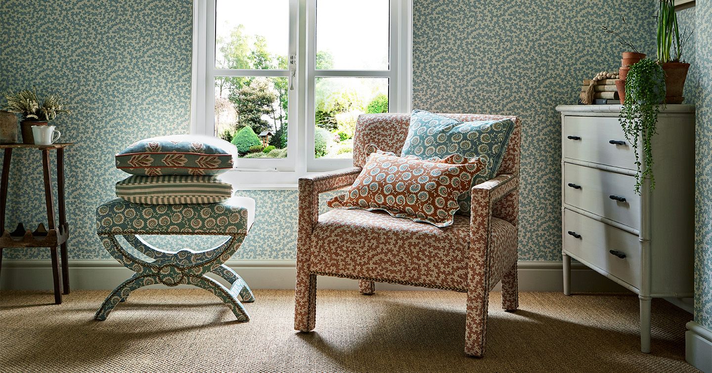
Monochrome schemes
Monochrome schemes use different shades of one color. This creates a calm and unified look. You can mix textures to add interest without changing colours. For example, pair a soft cotton with a shiny satin in the same hue. This balance makes your space feel cohesive.
Using monotone schemes is great for small spaces too. It can make rooms appear larger and brighter. Lighter shades help reflect light, while darker tones give depth. Let your imagination flow as you explore various fabrics and textures within your chosen color palette.
Complementary Colours
Complementary colours make a bold statement. These colours sit opposite each other on the color wheel. For example, red and green or blue and orange are complementary. Using these colours together can create visual interest in your designs.
Mixing complementary colours helps achieve color harmony. Pairing bright tones with darker shades adds depth to patterns too. Try mixing striped fabric in navy with floral prints that have pops of coral.
This approach keeps your decor lively while maintaining balance and style blending throughout your space.
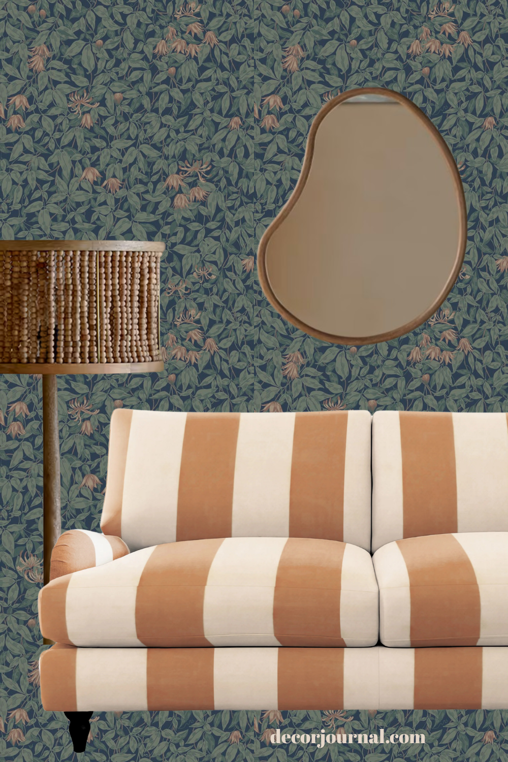
Combining Different Types of Patterns
Mixing stripes and florals can bring a playful vibe to any outfit. Try pairing geometric shapes with organic patterns for a fresh look that pops!
Stripes and Florals
Stripes and florals are a great way to mix patterns and create a fun look. They combine both linear and organic styles. Stripes add structure to your design, while florals bring softness. This contrast works well together.
Choose colours wisely for harmony. For example, use bold stripes with soft floral shades or pick matching tones from the flowers. This mix keeps things balanced while making a statement in home decor or outfits.
Play around with different sizes of stripes and flowers for an exciting effect!
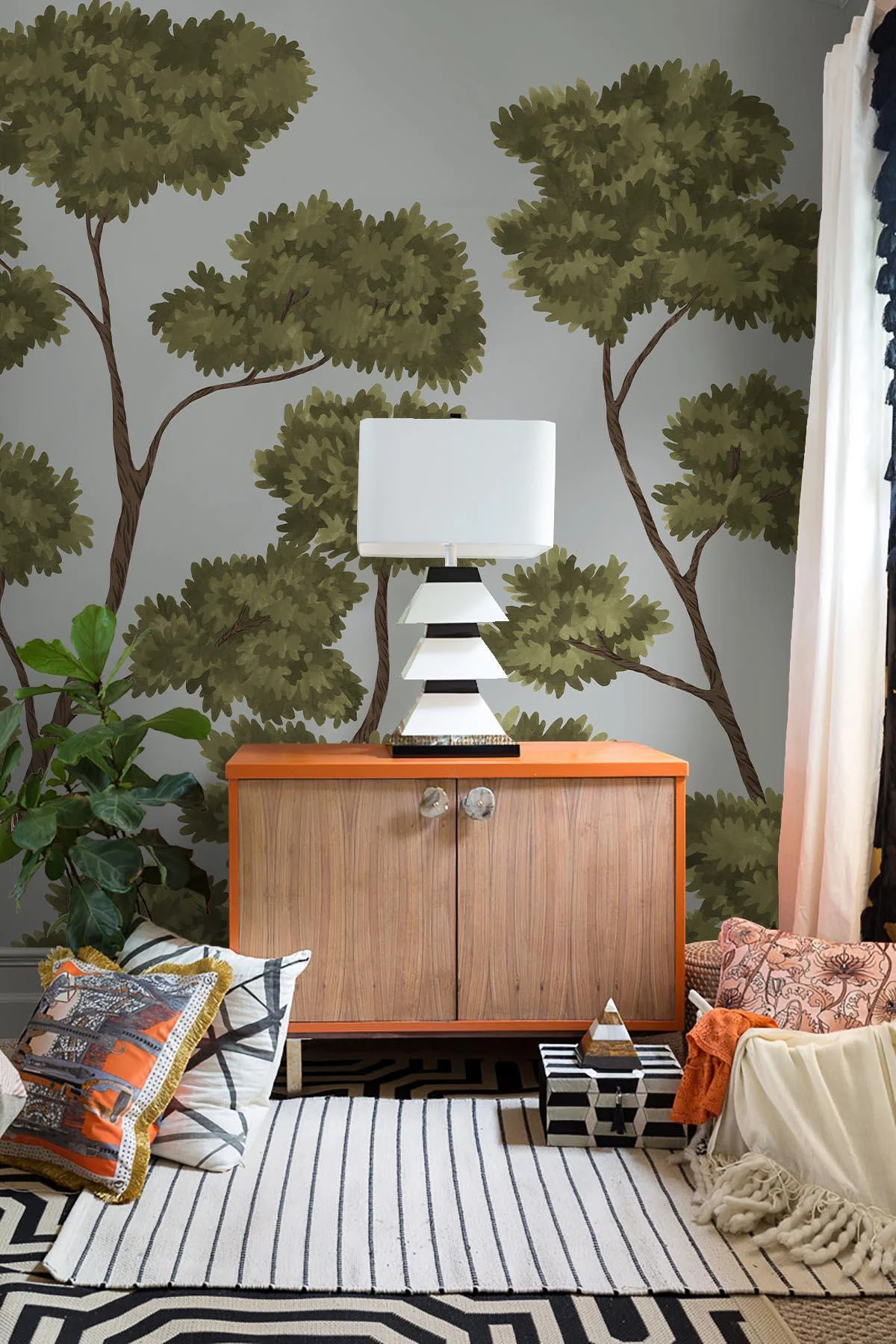
Geometric and Organic Patterns
Geometric patterns use shapes like squares, triangles, and circles. They are sharp and structured. These designs add a modern touch to any space. Organic patterns are different; they mimic nature with curves and flowing lines. Think of leaves or waves. These patterns bring softness and warmth to your decor.
Mixing geometric and organic patterns can create a lively look. The key is balance. Use one type as the base and let the other shine as an accent. This creates interest without overwhelming the eye.
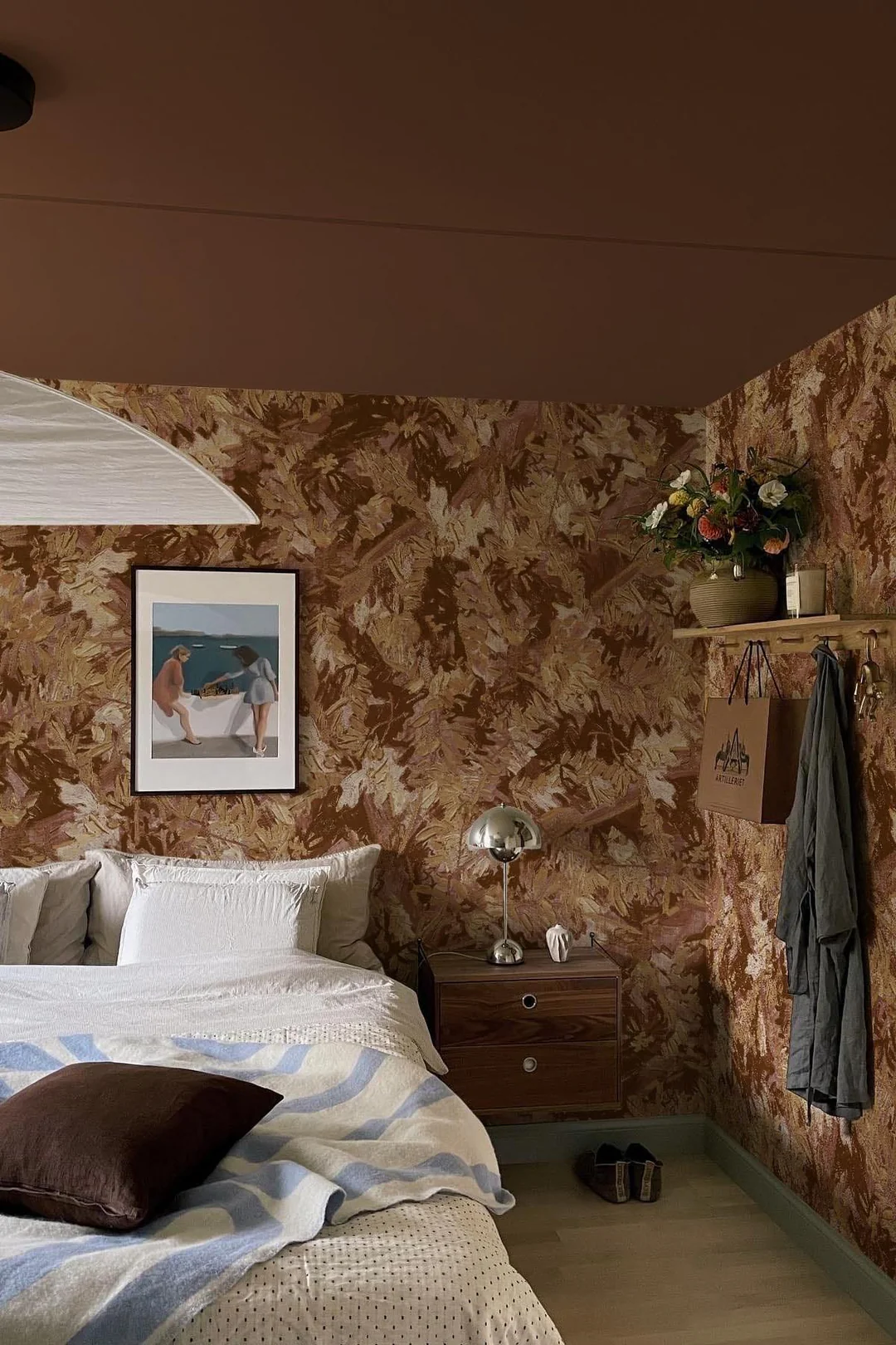
Adding Texture to Enhance Patterns
Textures add depth to patterns. Soft fabrics like velvet or linen can bring warmth. Mixing textures keeps the eye moving and adds interest. Pair a smooth floral with a rough, woven stripe for contrast. This creates a rich look that draws attention.
Different textures can make bold patterns feel balanced. For example, if you use bright geometric shapes, try soft cushions in neutral colours made of cotton or wool nearby. The change in texture helps calm the overall design while keeping it lively.
Balancing Bold and Neutral Patterns
Bold patterns grab attention. They stand out in any space. Neutral patterns provide balance. They calm a bold look and let it shine. Use large, eye-catching designs with small, subtle ones. This mix creates harmony.
Choose colours thoughtfully to connect the styles. Soft shades can tone down bright prints. Think about where each pattern goes in your design too. It’s all about creating visual weight that feels right together.
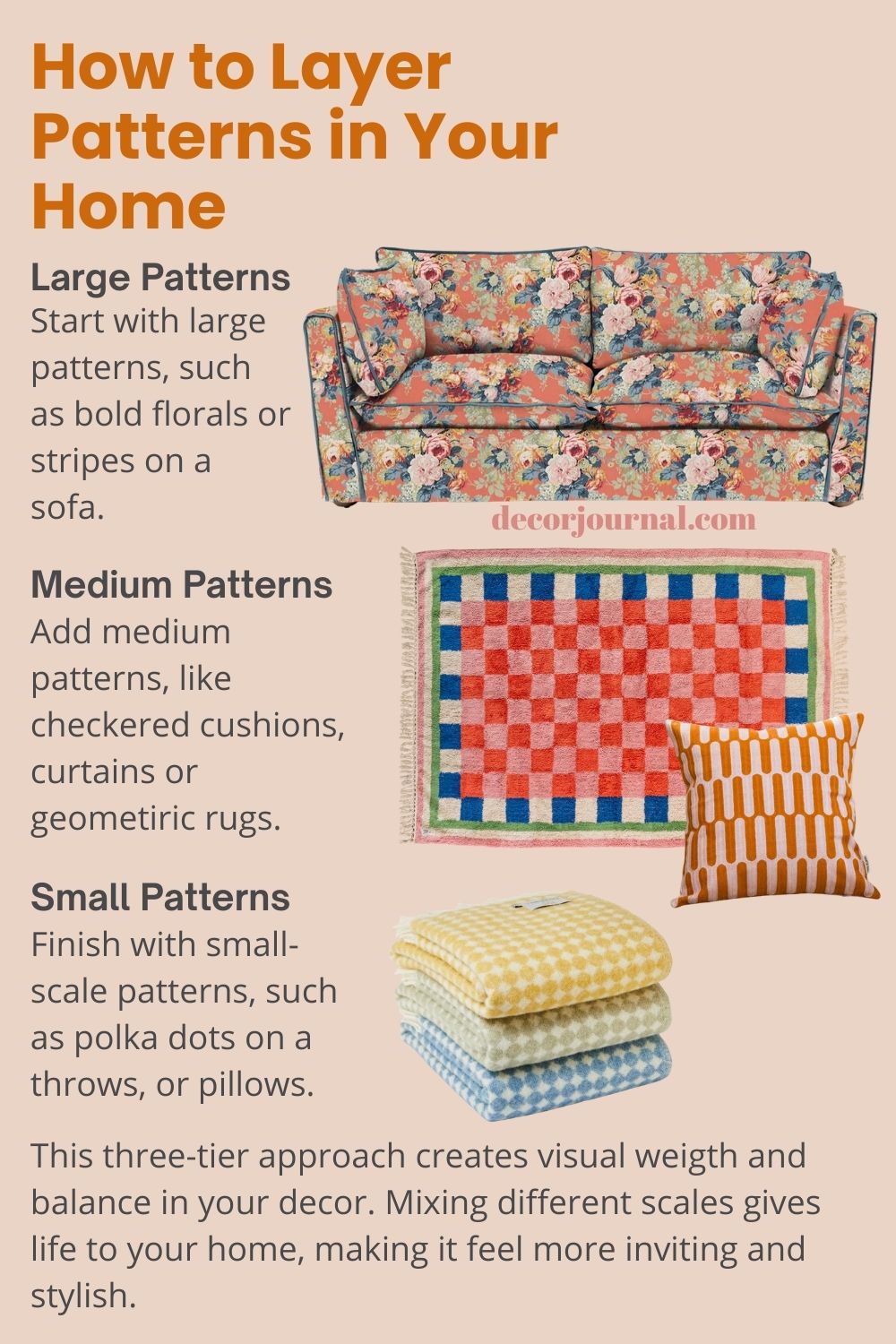
Layering Patterns for Depth
Layering patterns adds depth and interest to your space. Start with a large pattern as the base. Think of big floral prints or bold stripes on a couch. Next, add medium patterns, like checkered cushions or geometric rugs. These should complement the larger design without clashing.
Finally, finish off with small-scale patterns. Polka dots on throw pillows work well here. This three-tier approach creates visual weight and balance in your decor. Mixing different scales gives life to your home, making it feel more inviting and stylish.
Common Mistakes to Avoid
Mixing patterns can be tricky. Many people make mistakes that hurt their style. Here are some common errors to watch out for.
- Ignoring scale variation. Mixing large and small patterns can create chaos, not harmony.
- Clashing colours. Using too many different colours can overwhelm the eye. Stick to a cohesive color palette for better balance.
- Overloading on texture. Too many textures can confuse your look. Choose a few key textures to enhance your patterns instead.
- Skipping visual weight consideration. Heavier patterns need lighter ones to balance them out; otherwise, one pattern will dominate.
- Forgetting about proportions. Make sure you mix patterns in a way that fits your space and body shape for the best effect.
- Not considering room context in home decor. Patterns should match the mood of the room and its purpose, so think about how they feel together.
- Using similar styles of patterns only. Mixing stripes with florals adds interest and fun; sticking to one type makes things flat.
- Neglecting personal style preferences when choosing patterns can lead to regret later on; stick with what resonates with you for confidence in your choices.
Conclusion
Mixing patterns helps every space feel fresh and bold. It takes a mix of color, scale, and style to do it well.
This guide structure gives readers simple tools how to mix patterns at home or in fashion. Teaching about scale mixing, color harmony, and visual balance makes pattern matching less scary. Using real examples helps people build confidence fast.
For everyday use, start small; maybe try one patterned pillow next to a striped throw blanket if you want change but feel nervous about making mistakes. Build up as you learn what feels right in your room.
Pick colours that complement each other; it makes life (and your room) so much easier. This post is perfect for anyone who wants to dip a toe into mixing patterns without spiralling into stress or overspending. It lays out the basics in a way that feels effortless and builds your confidence one step at a time, exactly what every busy, design-loving soul needs today!