
If you imagine 18th century paint palettes as a sea of dusty beige and muted greys, you’d be mistaken. Back then, choosing a palette wasn’t a quick browse online or a casual trip to the paint shop. Pigments were rare treasures, imported from afar and laboriously ground by hand. In the 1700s, your colour scheme was a high-stakes status symbol; its vibrance told the world exactly how much power and money you held.
If you’ve ever been lucky or, in some cases, unlucky enough to live in a period building and strip back the literal centuries of paint, you’ve partaken in the art of colour archaeology. It’s an exercise in discovery, often revealing vivid, gutsy hues that sit worlds away from the safety of 1980s magnolia.
But once you peel back those layers of ‘safe’ neutrals, what exactly are you looking for? The answer isn’t just a colour; it’s a social hierarchy in a pot. To understand the true 18th-century home, we must look at the ‘Pigment Power List’ of the 1700s, and because history belongs in the modern home, I’ll be sharing my favourite contemporary paint alternatives and curated mood boards to help you style these heritage hues today.
Table of Contents
Beyond the Beige: From Prussian Blue to the Verdigris Luxury 18th Century Paint Palettes
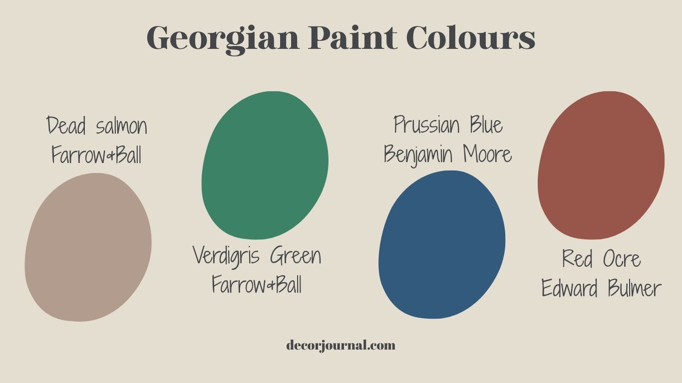
The trendsetters of the 18th century showed off their prowess in both fashion and technology by flaunting two specific hues in their homes: the groundbreaking Prussian Blue and the notoriously temperamental Verdigris. These weren’t just paints; they were the 1700s version of a ‘tech disruptor’ and a ‘couture’ statement.
I can never write a blog post without picking up the kind of random facts that probably make me the most annoying person at a dinner party. In 1704, a chemist named Diesbach was in a Berlin lab trying to cook up a batch of deep red, only to witness one of history’s most beautiful accidents. He’d unwittingly used potash contaminated with, of all things, dried cattle blood. Instead of a vibrant crimson, he watched as his beaker turned a startling midnight blue. Yes, the first ‘high-tech’ synthetic pigment was effectively a byproduct of animal blood and iron, accidentally birthing the moody Prussian Blue we still obsess over today.
Beyond the Beige: The Hardworking ‘Stone’ Tones of the 1700s
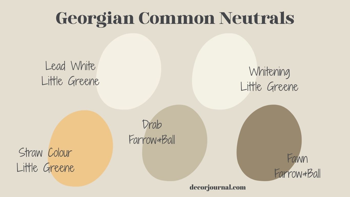
Now, back from my tangent, it wasn’t all a technicolour rainbow land. For every ‘status’ blue, there was a sea of common neutrals that provided the perfect, earthy contrast to those bright new hues. In the 1700s, most homes were built on a foundation of ‘stone’ colours, created from inexpensive earth pigments like ochre and umber.
Lead whites and creams were the workhorses of the era, acting as the base for almost everything. Then there were Drab and Fawn: muted greyish-browns and yellowish-greys. While they might sound dull by modern standards, in the 18th century, these tones were considered the height of practical sophistication ideal for ‘back of house’ service areas or modest parlours. Finally, there was Straw Yellow, a perennially popular, sun-drenched hue achieved with simple yellow ochre. These weren’t just background noise; they were the quiet elegance that allowed the ‘Power Pigments’ to truly sing.
Status in a Pot: The 18th Century’s Most Expensive Hues
When I was a child, many people I knew had that ONE special room that nobody was allowed in. I thought it was just in case the Queen came round for tea, obviously. Now that I’m older, I realise it was probably just the one room that didn’t get trashed by kids, a sanctuary of cleanliness.
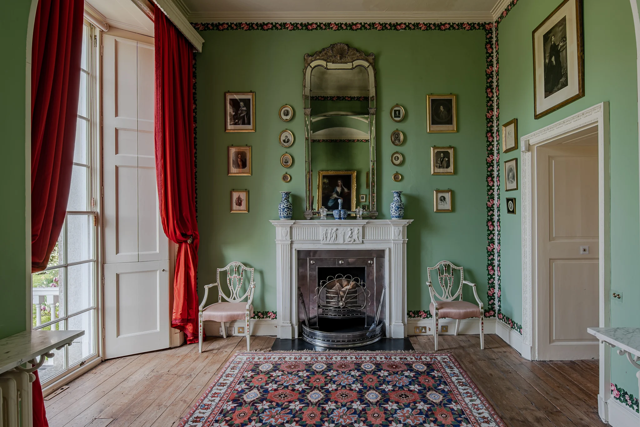
The Georgians had a similar ‘sacred’ approach to their entertaining spaces. In the Dining Room or the Drawing Room, the colours naturally became more intense; this was where Prussian Blue, Verdigris, Dead Salmon, and Red Ochre took centre stage. Walk into a room draped in a hue like that, and you just knew the canapés were going to be top-tier.
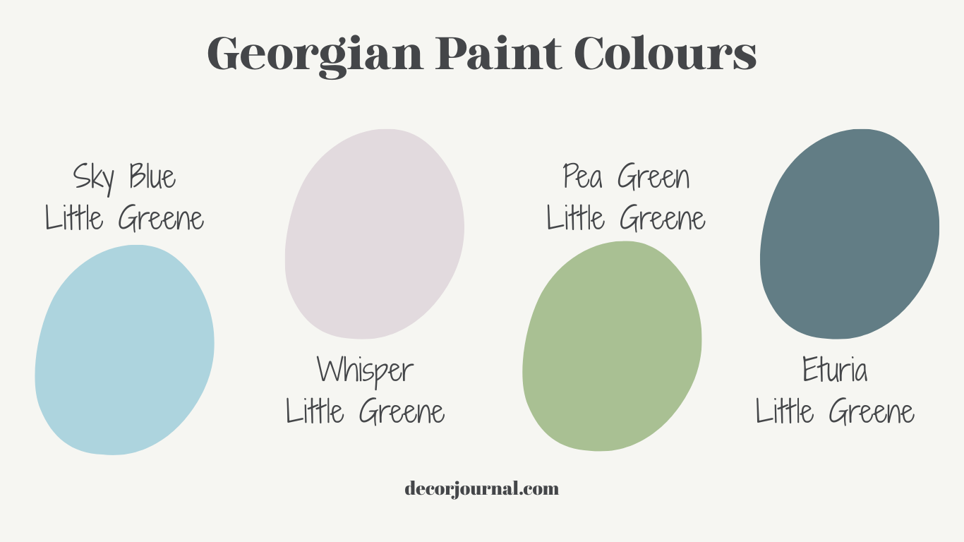
Pastel Power:How the Late 18th Century Found its Glow
Just as the heavy, dramatic ‘status’ pigments reached their peak, the aesthetic tide turned. Thanks to the sensational excavations of Pompeii and Herculaneum, the late 18th century fell head-over-heels for the ancient world. Out went the moody, blood-born blues and the high-maintenance greens; in came a palette of ethereal pastels. This was the Neoclassical shift a period where interiors traded gravitas for ‘glow’, embracing the delicate sky blues and soft lilacs that would eventually define the iconic Wedgwood look.
The Archeology Cheat Sheet: Pigments, Power, and Purpose
| Color Group | Pigment Source | The Vibe & Meaning |
| Sky Blues | Prussian Blue | Intellectual & Modern. The “tech-disruptor” color for the 18th-century wealthy. |
| Sage & Olive | Terra Verte | Calming & Focused. The ultimate choice for libraries and private studies. |
| Oxblood | Iron Oxide | Masculine & Strategic. A dining room favorite (cleverly designed to hide dinner mess). |
| Pinks | Cochineal / Madder | Candle-lit Elegance. Soft, rosy hues that practically glowed in the evening. |
Beneath the Surface: The Secret to that Chalky Georgian Glow
When it comes to a historic interior, the finish is just as vital as the pigment. The right sheen can determine whether a room feels like a cold museum or a warm, lived-in sanctuary.
If you really want to nail the Georgian look, you have to look past the colour and focus on the texture. Back then, there was no such thing as ‘one tin fits all. ‘ The magic happened in the deliberate contrast between powdery, soft walls and gleaming, glossy woodwork.
This brings us to the great distemper vs. oil debate:
- Distemper (The Matte Hero): This water-based paint was the standard for ceilings and walls. It provided that signature ‘powdery’, ultra-matte look we now associate with heritage homes. It’s the reason those old rooms look so soft and diffused under candlelight.
- Oil Paint (The Glossy Guard): Reserved for the ‘woodwork’ skirting boards, architraves, and doors. By keeping these in a higher gloss, the Georgians created a sophisticated visual break from the matte walls, making the architectural bones of the room really pop.
Modern Alchemy: Why Georgian Pigments are the 2026 Interior ‘Secret Weapon’
This whole post actually started with me playing around with casein distemper moodboards and falling down the rabbit hole of 18th-century chemistry.
You see, back then, ‘paint’ wasn’t just something you bought in a tin; it was a living finish. Traditional soft distemper was made with animal glue, which meant it was actually reversible. You could literally wash it off the walls, which is exactly what the Georgians did every few years to keep their homes looking fresh.
Casein distemper, on the other hand, is the sophisticated cousin. Made with milk protein, it binds to the wall to create a wipeable, durable finish that still has that ethereal, chalky glow.
A word of warning for my fellow period-home lovers: if you suspect your walls are covered in old distemper, stop what you’re doing. If you slap modern paint over it, the whole lot will crack and peel off within weeks.
The ‘Wet Finger’ Test: Dampen your finger and rub the wall firmly in a circle. If the paint dissolves into a chalky paste on your skin? That’s Soft Distemper. You’ll need to wash the walls back to the plaster before you even think about a paintbrush.
You might be wondering why I’m obsessing over pigments from 300 years ago. This isn’t just for the history buffs. Absolutely not. There is a scientific and aesthetic reason why these shades feel so much “better” than a standard modern beige.
Have you ever noticed that “flat” modern paints can feel a bit cold or “dead” once they’re on the wall? Historical pigments were different. Because they often contained lead or lime, they didn’t just sit on the surface; they had a crystalline structure that reflected light back into the room. It’s that soft, inner “glow” we’re all chasing. By choosing modern heritage ranges that mimic these old formulas, you’re not just picking a color; you’re choosing how your room glows with the sun.

We are living in an era of “quiet luxury” and organic textures. These deep, grounded Georgian tones provide the ultimate stage for your home’s best features. Whether it’s the heavy weave of Lithuanian linens or the rich patina of antique wood furniture, these colors act as a soulful anchor. They don’t compete with your decor; they make it look like it’s worth ten times more.
How to Source the “Heirloom Look” Today
I have always had a soft spot for heritage colors, but choosing the pigment is only half the battle; getting the texture right is where the real 18th-century magic happens. Here is your cheat sheet for matching the vibe to the bucket.
Quick Checklist: Which finish do you need?
| If you want… | Ask for… | Best Brand |
| Powdery, matte walls | Soft Distemper | Edward Bulmer / Farrow & Ball |
| Authentic historical colors | English Heritage Range | Little Greene |
| Breathable walls for old stone | Limewash | Rose of Jericho |
| Glossy, durable woodwork | Traditional Oil Gloss | Little Greene |
Modern Heritage: 18th Century Paint Palettes Reimagined
It’s one thing to understand the history of a pigment, but it’s another to see how it breathes in a modern room. Below, I’ve translated the three pillars of 18th century paint palettes, red, blue, and green, into contemporary mood boards. These aren’t just recreations of the past; they are a blueprint for how to use 18th-century soul to create a 21st-century sanctuary.
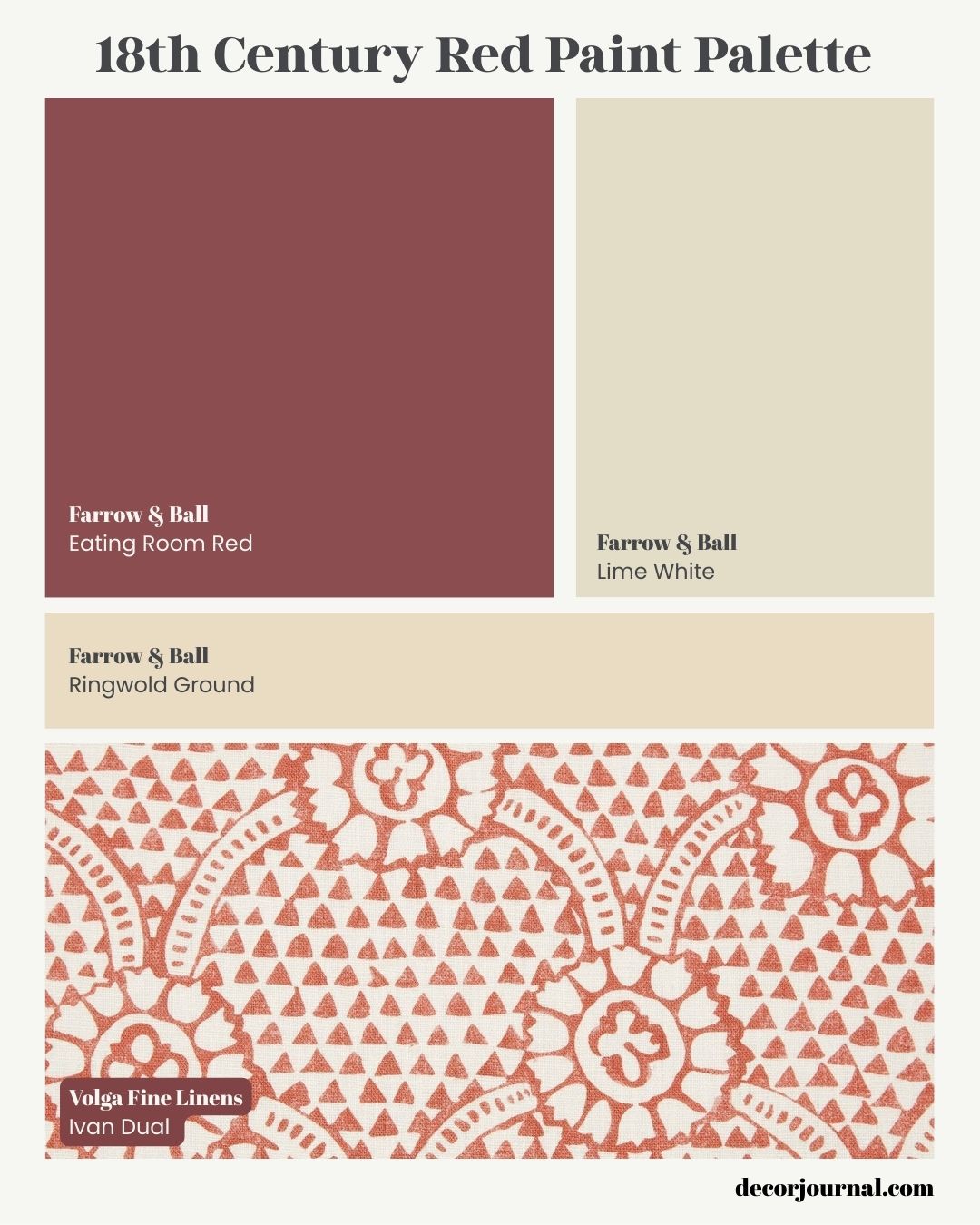
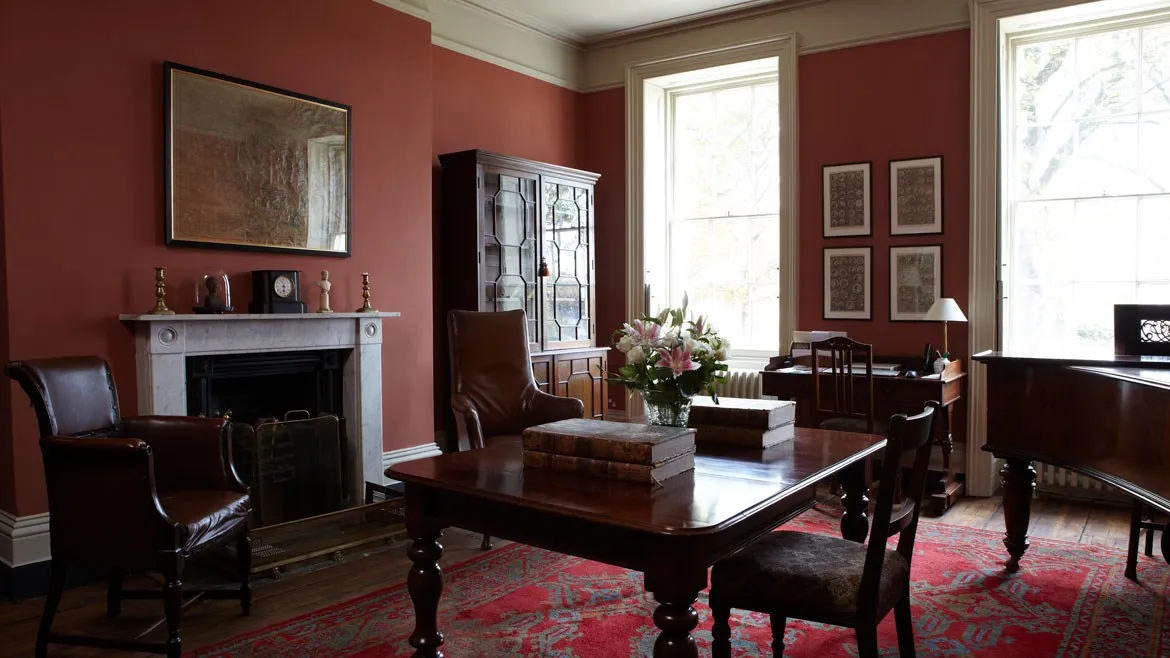
Some things never date; take, for example, this 18th-century-inspired red palette. Historically, a deep red like Eating Room Red was used to signal masculinity and status and, practically, to hide the ‘mess’ of a busy dining room. In a 2026 home, we can soften that intensity by pairing it with lime white and the creamy depth of Ringwold ground. When layered with a patterned linen like this Ivan Dual from Volga, the room stops feeling like a museum and starts feeling like a lived-in sanctuary.”
One Tiny “Designer Archeologist” Note:
If you want to be super technical, Eating Room Red is a classic “Common Neutral” of the higher-end variety. It’s grounded, earthy, and looks incredible under low light (that “Georgian Glow” again!).
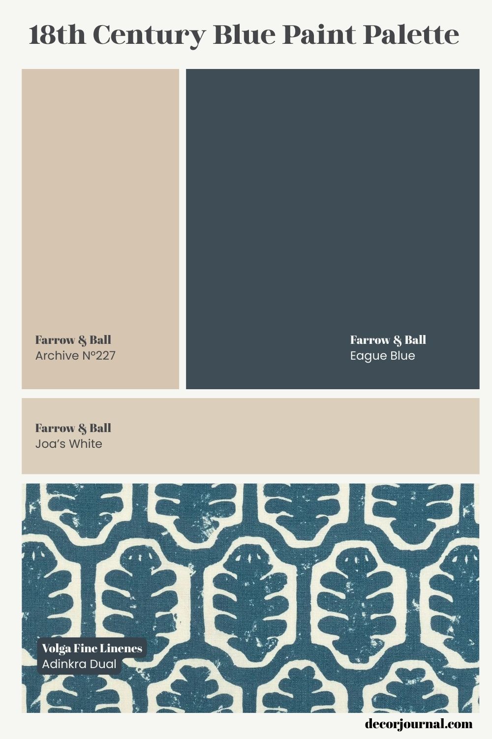
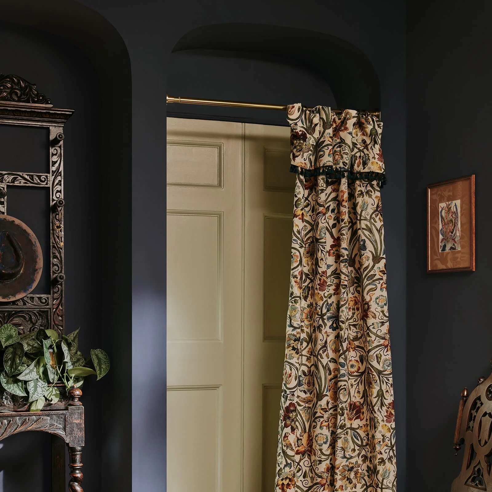
If red was the color of the dining room, blue was the color of the library, a space for intellect and modern luxury. Here, Hague Blue takes center stage as our contemporary answer to the expensive Prussian blues of the 1700s. To keep it from feeling too cold, I’ve layered in Archive and Joa’s White, neutrals with a red-based warmth that makes the blue feel lived-in rather than stark. It’s the perfect backdrop for a room filled with books and low light.

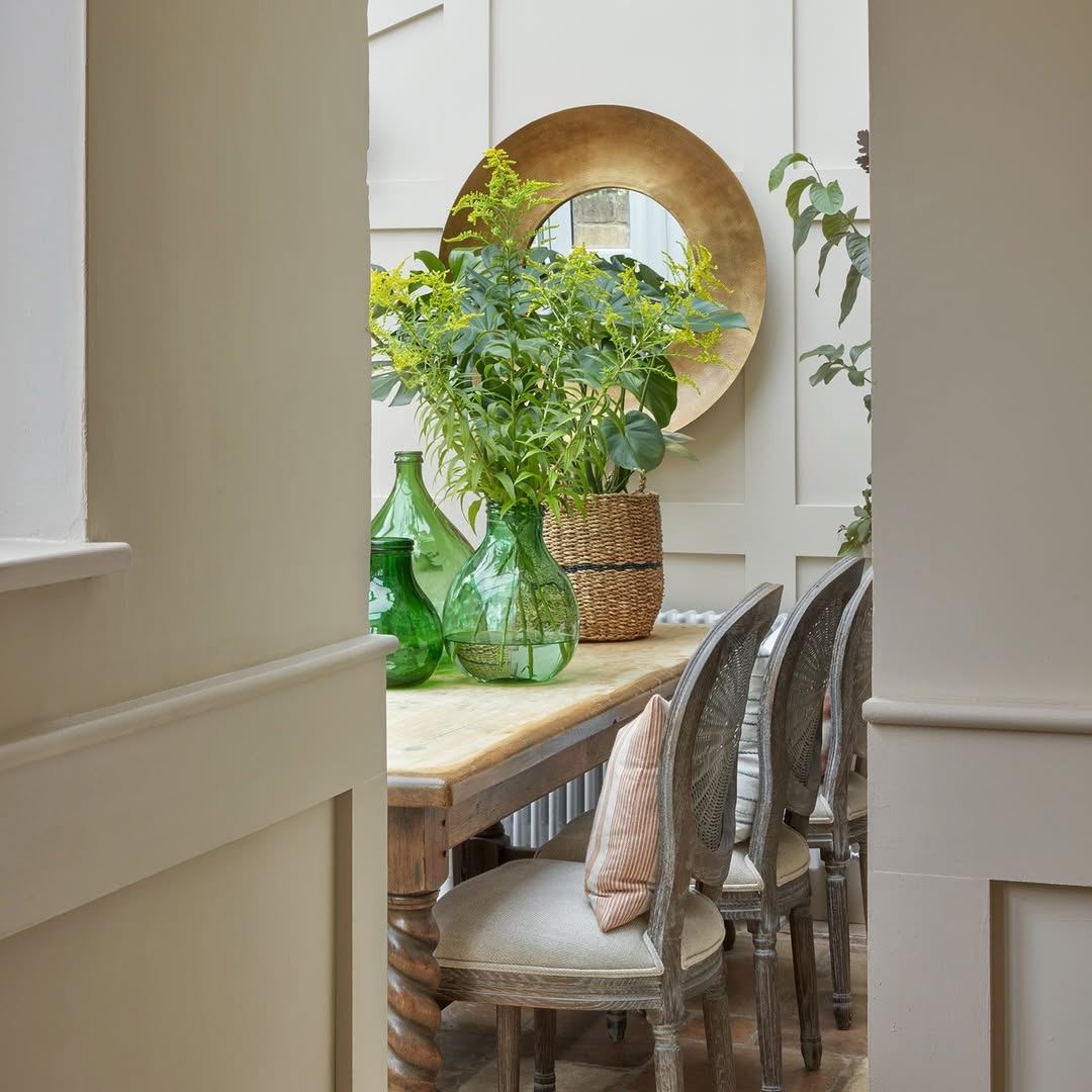
Finally, we have the most restorative of all Georgian hues: Pea Green. In the 1700s, greens like this were created using Terra Verte to bridge the gap between the house and the garden. In a modern home, it is the perfect antidote to digital burnout. I’ve paired it here with Tunsgate Greenand James White to keep the space feeling light and airy. When accented with a botanical print like this Cape Botanical linen, the result is a room that feels grounded, quiet, and effortlessly timeless.”
The “Heritage Checklist”: 5 Historical Color Rules to Live By
If you want to nail the Georgian look without your home feeling like a period drama set, follow these five “archaeology” rules:
- Contrast your Textures: Pair ultra-matte, powdery walls (Distemper) with high-gloss woodwork (Oil) to create architectural depth.
- Assign Colors by Purpose: Use deep oxbloods for dining spaces to hide “mess” and create intimacy; use sage or olive for studies to encourage focus.
- Prioritize the “Glow”: Choose pigments like iron oxide or terra verte that react to natural light rather than flat, synthetic modern beiges.
- Balance Status with Neutrals: If using a “status blue” like Hague Blue, anchor it with warm, stone-based whites like Joa’s White to keep the room feeling lived-in.
- Let the fabric lead: Always layer your paint choices with organic textures. A heavy Lithuanian linen will catch the light and the paint color differently than a flat cotton, adding that final layer of authenticity.
The Final Edit: Bringing the 18th Century Home
We’ve traveled from the iron-rich earth of the Georgian “common neutrals” to the high-status, light-drinking depths of Prussian blue. If there is one thing I hope you take away from this dive into the archives, it’s that color is never just a surface treatment; it is an architectural tool.
The “Georgian Glow” wasn’t a happy accident; it was a deliberate calculation of mineral pigments, milk proteins, and natural light. Whether you’re restoring a lime-plastered cottage or just trying to give a modern apartment a bit more “gravity,” the rules remain the same:
- Trust the Chemistry: Don’t be afraid of casein or distemper; the texture is 90% of the magic.
- Embrace the Purpose: Let your room’s function dictate the pigment, from restorative pea greens to intimate oxbloods.
- Layer the History: Use those warm, stone-based whites to anchor your bolder “Status” colors.
Over to You…
I’m currently leaning towards a full-immersion Hague Blue library with plenty of aged brass, but that eating room red is calling to me for a candlelit dining space.
Which of the three palettes would you bring into your home? Or are you a “soft distemper” purist for your ceilings? Let me know in the comments below; I’d love to hear how you’re translating these palettes for your own space.