
If you are looking for how to style folk textiles with depth and meaning, look no further than the Balkan heritage palette. The Shevitza palette is a profound mix of ancestral storytelling and grounded heritage energy. These intricate, hand-woven blankets are far more than mere textiles; within every thread lies a centuries-old “coded language” of protection, rendered in historical pigments that have survived the test of time. To bring this kind of soul to a contemporary home, we have to look beyond simple “colour matching” and lean into the Fiona de Lys Delsyan method of atmospheric resonance. This guide will show you how to translate these ancient threads into a sophisticated, modern interior.
To truly make these folk palettes work in a contemporary home, we have to look beyond simple color matching and lean into a deeper theory that Fiona de Lys calls “Delsyan color clarity.” It’s about respecting the ‘atmospheric needs’ of the textile. Rather than just picking a ‘pretty red,’ the goal is to find the specific shade that resonates with the natural light of your room and your own emotional goals for the space. This is decorating with feeling; it’s choosing harmony over decoration to ensure your home feels deeply intentional, rather than just ‘done.
In this post, I’m breaking down the exact color story of these heritage blankets using my favorite high-end pigments from Farrow & Ball, Benjamin Moore, and Little Greene. It’s about bridging that gap between ancient craft and the sophisticated, “ancestral modern” reality of the homes we live in today.
Table of Contents
The Meaning of Folk Textiles: Decoding the Shevitza Palette
To understand how to place these pieces in your home, we first have to decode the visual shorthand woven into the wool.
| Symbol & Form | Traditional Meaning | Designer’s Intent | Delsian “Atmosphere” |
| The Mother’s Sign (The Rhombus/Diamond) | Represents the Goddess Mother, fertility, and the earth. | A symbolic wish for family continuity and a “blessed” home. | Grounding: Creates a sense of security and nourishment in bedrooms or nurseries. |
| The Makas (The “Scissors” or X-Shape) | The union of opposites: male/female, heaven/earth. | The ultimate symbol of equilibrium and shared peace. | Balance: Provides the visual “weight” needed to settle the energy of high-traffic living areas. |
| The Tree of Life (The Vertical Axis) | Connects the three worlds: Roots (Past), Trunk (Present), Crown (Future). | Encourages personal growth while staying rooted in heritage. | Vertical Harmony: Helps “lift” the eye in a room, creating a feeling of purpose and aspiration. |
| The Elbetica (The 8-Pointed Star) | The eight directions of the world and the points of the compass. | Acts as the “Anchor” of the home to keep it steady in all seasons. | Core Stability: Offers a focal point that feels steady, centered, and geographically “right.” |
The Palette Breakdown: Meet the Colours
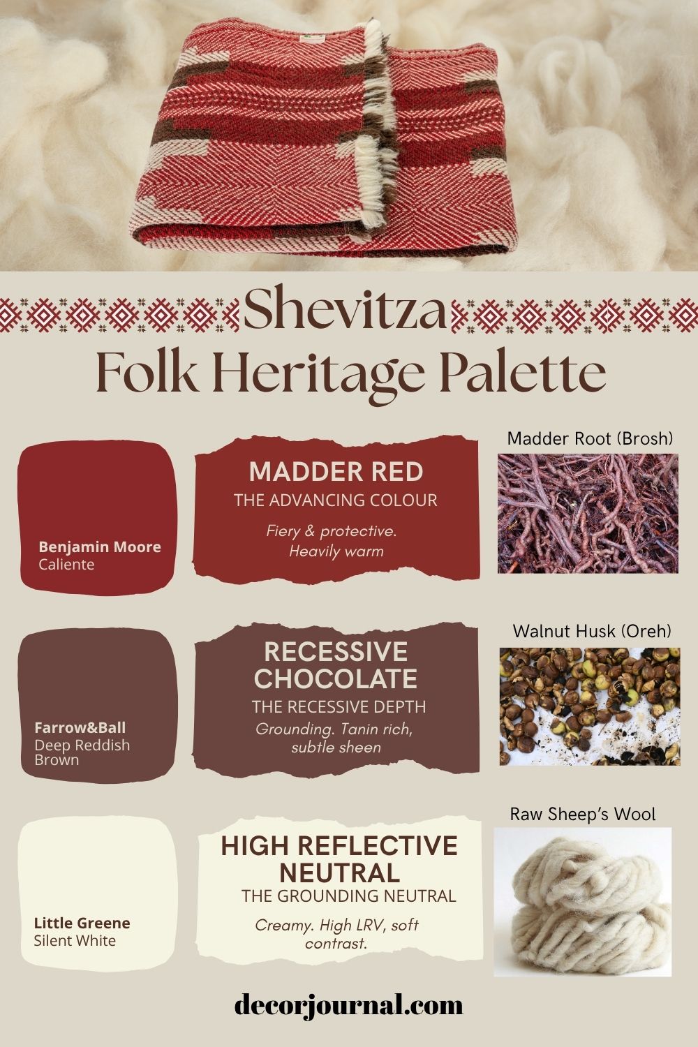
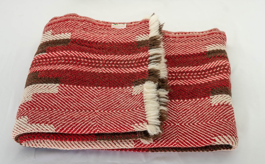
In traditional Shevitza weaving, the colours weren’t synthetic; they were “living” tones created from plants, minerals, and even insects. Here are the primary natural sources that created that iconic palette:
1. The Advancing Red: Madder Root (Brosh)
This is the heart of the Shevitza.
- The Source: The dried and ground roots of the madder plant.
- The Delsyan Resonance: Depending on the soil’s calcium content, madder can range from a bright, fiery orange-red to a deep, earthy brick. It is a “heavy” pigment that feels warm and protective.
- Modern Match: Benjamin Moore’s Caliente or Farrow & Ball’s Blazer.
2. The Recessive Chocolate: Walnut Husks (Oreh)
Those deep, grounding stripes in your blanket come from the earthiest of sources.
- The Source: Green walnut shells or the bark of the walnut tree.
- The Delsyan Resonance: This isn’t a “flat” brown; it’s a “recessive” tone that creates depth. Because it’s tannin-rich, it has a natural slight sheen that catches the light differently than synthetic dyes do.
- Modern Match: Farrow & Ball – Tanner’s Brown or London Clay.
3. The High-Reflective Neutral: Raw Sheep’s Wool
The “white” in these blankets is rarely a true, bleached white.
- The Source: Simply washed, undyed wool from local Balkan sheep breeds.
- The Delsyan Resonance: This provides the high light-reflective value (LRV). It’s a creamy, “fatty” white (due to the residual lanolin) that softens the high contrast of the reds and browns.
- Modern Match: Little Greene – Shirting or Farrow & Ball – School House White
Shevitza Palette Guide: Bringing the Folk Modern
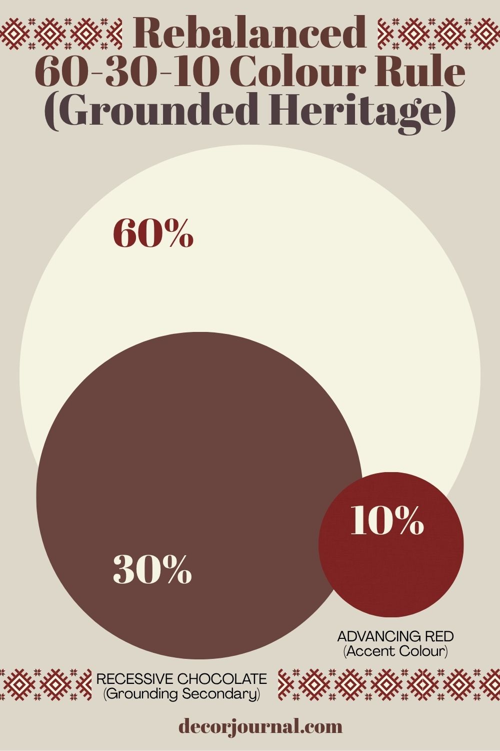
When I’m planning a colour scheme, I always come back to the 60-30-10 rule. It’s the industry’s most reliable framework, and I’ve been known to point it out during trips to IKEA, much to my family’s annoyance!
It’s a simple formula for balance: 60% of the room (usually the walls) is your foundation; 30% (secondary surfaces like furniture or rugs) provides the depth; and that final 10% is reserved for your punchy accent colours.
But how do we take this standard rule and infuse it with the Delsian soul of a Shevitza blanket? Let’s break down how to map these ancestral pigments onto a modern room.
Accent Door Shevitza Palette
If you’ve followed my work for a while, you’ll know I am a tireless advocate for the accent door. While we’ve categorised Benjamin Moore’s Caliente as our ‘Advancing Red’, imagine the atmospheric power it holds when applied to a door and its surrounding woodwork. Against the high-reflective clarity of Little Greene’s Silent White, that bold, madder-inspired red creates a focal point that feels both ancient and incredibly sophisticated. It’s the perfect way to let that 10% accent do the heavy lifting in a room.
Reading Nook Shevitza Palette
Imagine a cosy reading nook drenched in the protective glow of Caliente. By pairing those deep, ‘Advancing Red’ walls with the ‘Recessive Depth’ of dark wood furniture and the crisp, ‘High-Reflective’ clarity of Silent White accents, you create a true sanctuary. Drape a hand-woven Shevitza blanket over your chair, and you have the perfect, intentional space to curl up with a book, a room that feels as grounded in history as it is in comfort.
Beyond Decoration: Why Heritage Always Feels Like Home
These traditional patterns and colours have survived for centuries because they offer something deeper than a trend: they bring a genuine sense of security and a sustainable, quiet joy. When we “decode” a Shevitza blanket and map its pigments into our modern rooms, we aren’t just decorating; we are anchoring our homes in a history of harmony.