
“Colour Capping” is a freshly coined term from @benjaminmoore, but the concept itself has wonderfully old-school roots; think classic Italian interiors and fresco artistry, where colour was used not just to decorate but to shape how a space feels. By layering tonal variations across the ceiling, walls, and trim, you can play clever tricks with perception, stretching a room’s height, adding depth, or wrapping it in an intimate, cocooning warmth. The magic lies in the mix: the room’s proportions, the contrasts you choose, and the direction your gradient flows all alter the mood entirely.
Of all the current colour trends, this one is by far one of my personal favourites because it offers so much scope. You can go dramatic and enveloping with deep, velvety hues; serene and airy with misty neutrals; or utterly contemporary with a soft tonal shift that makes the architecture sing. Whether you’re aiming for cosy sophistication or modern minimalism, colour capping lets you sculpt the atmosphere with nothing more than a paintbrush, and that, to me, is pure design alchemy.
Colour Capping: A Mood Booster in Disguise
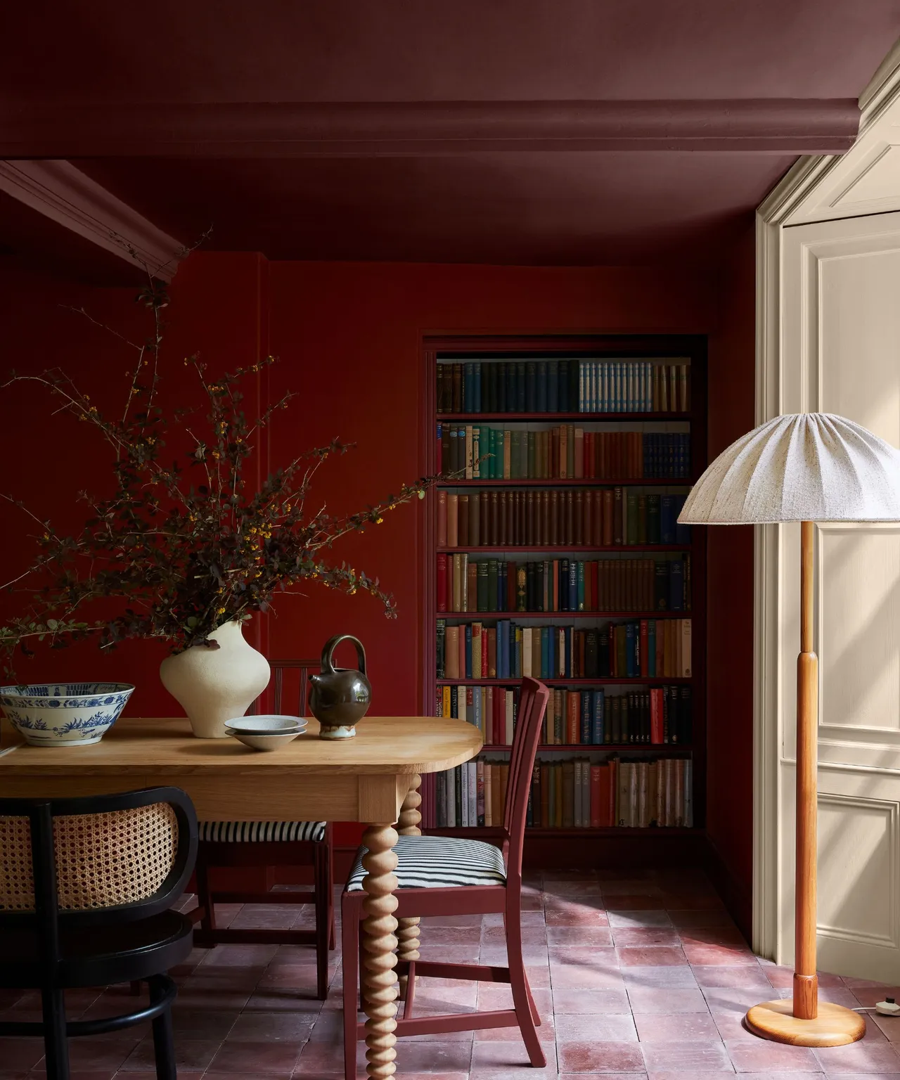
Colour capping has a huge emotional impact; there’s something wonderfully immersive about wrapping a room in colour that flows seamlessly from wall to ceiling. Whether you choose tones from the same hue or shades that gently complement each other, the effect is both cocooning and uplifting. It softens bold colours, making them feel approachable, and adds a sense of cohesion that instantly calms the eye. The real magic lies in how it shapes a space: lofty rooms feel more grounded and inviting, while smaller spaces can feel either snug or surprisingly open, depending on your palette. It’s proof that when colour takes the lead, atmosphere follows.
When and Where to Use Colour Capping
For all its charm, colour capping isn’t a one-size-fits-all solution. As much as it’s my latest design obsession, I have to admit, my split-level entrance hall and lofty, vaulted living room simply won’t play along. Some spaces are just too architectural to be “capped”, no matter how head-over-heels I am for the look.
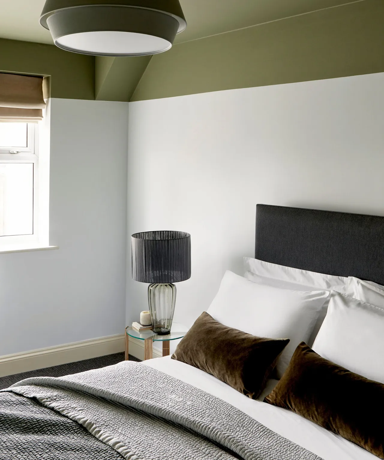
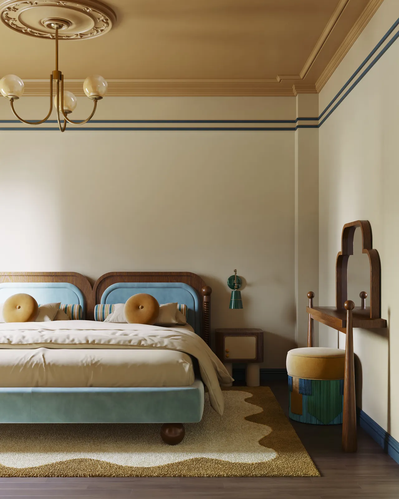
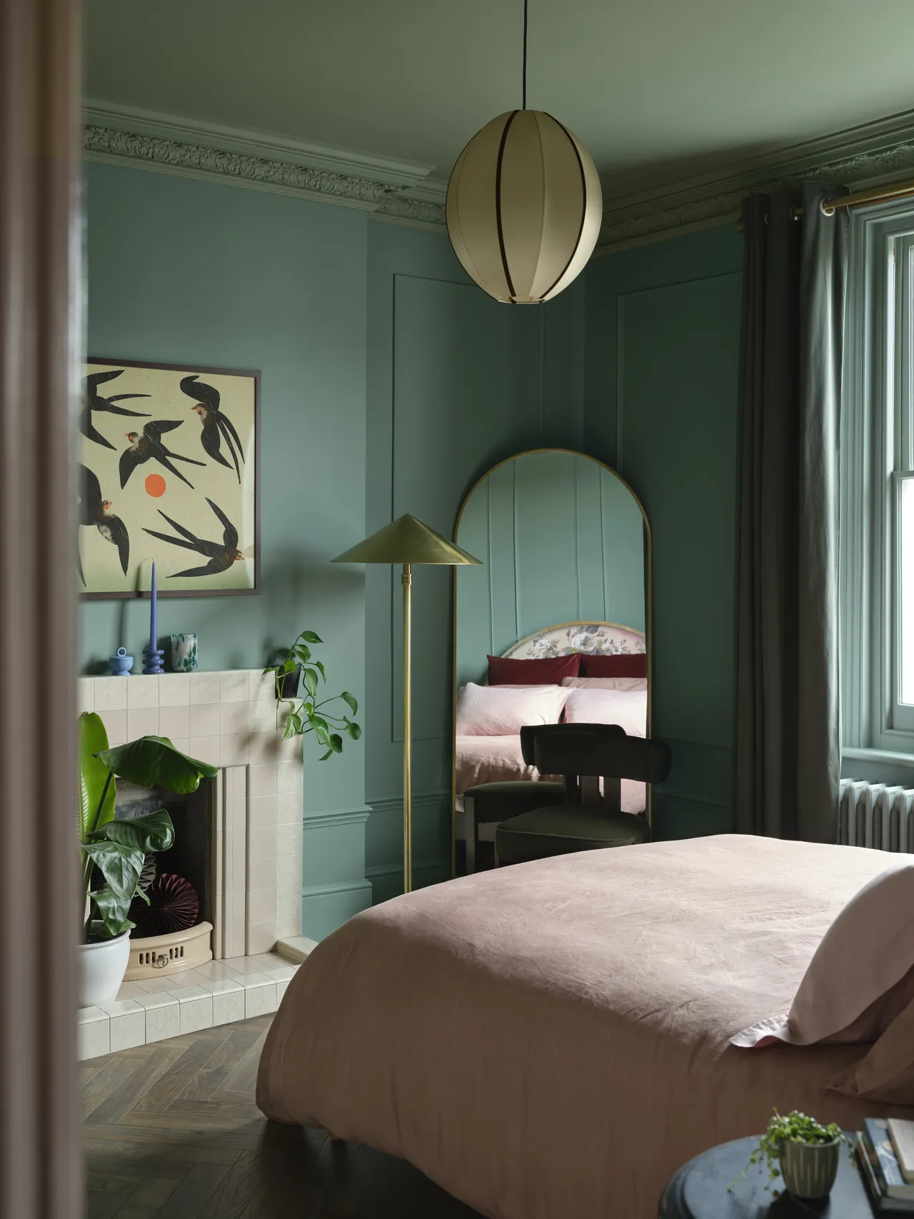
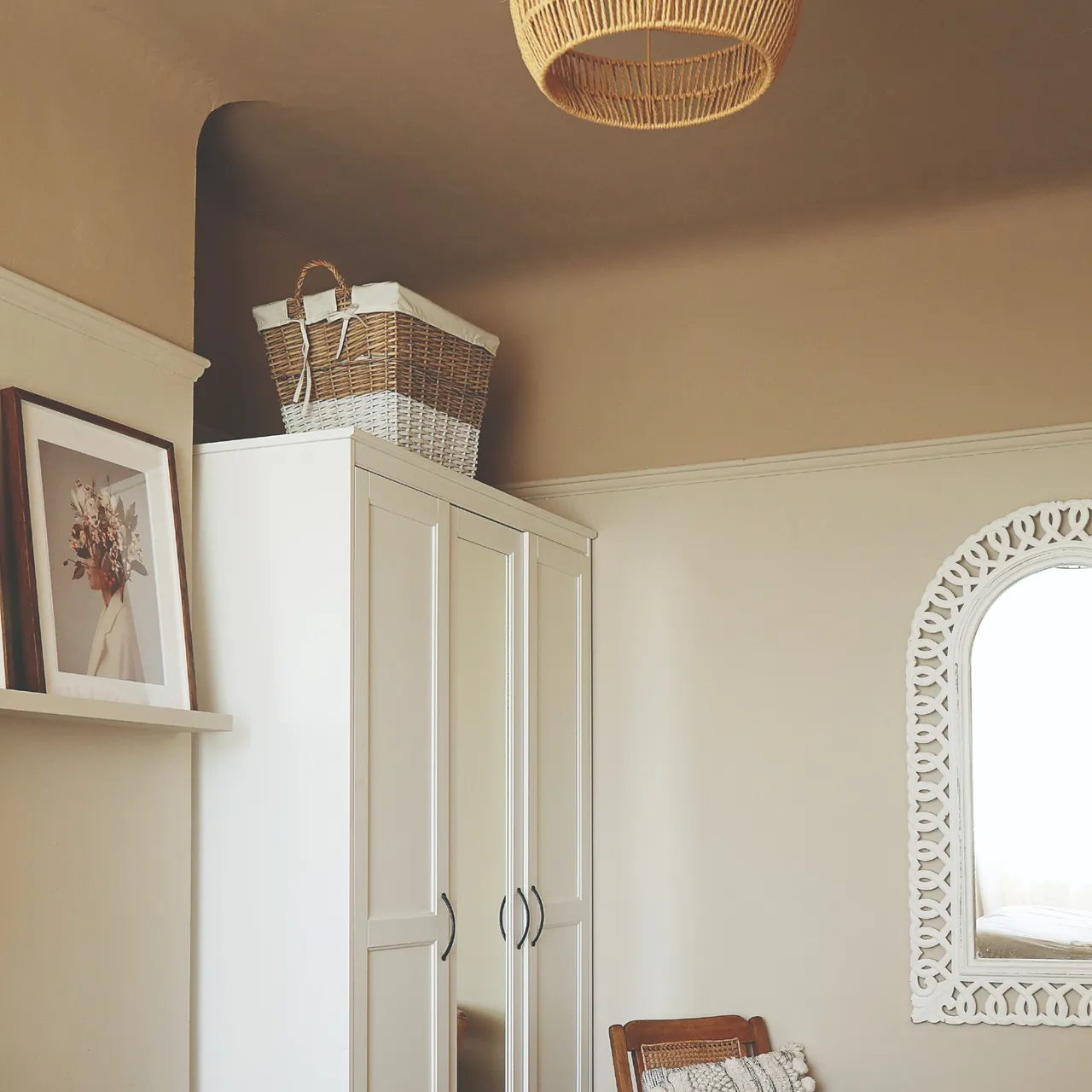
Bedrooms
After a long, busy day, what could be better than sinking under the duvet and feeling completely enveloped by the hue of your choice? That’s the beauty of colour capping; it’s more than just paint, it’s atmosphere, mood, and comfort all rolled into one. Whether you’ve chosen a soft blush that soothes or a deep inky blue that embraces you like twilight, the right colour can turn your bedroom into a personal retreat, a place that feels as good as it looks.
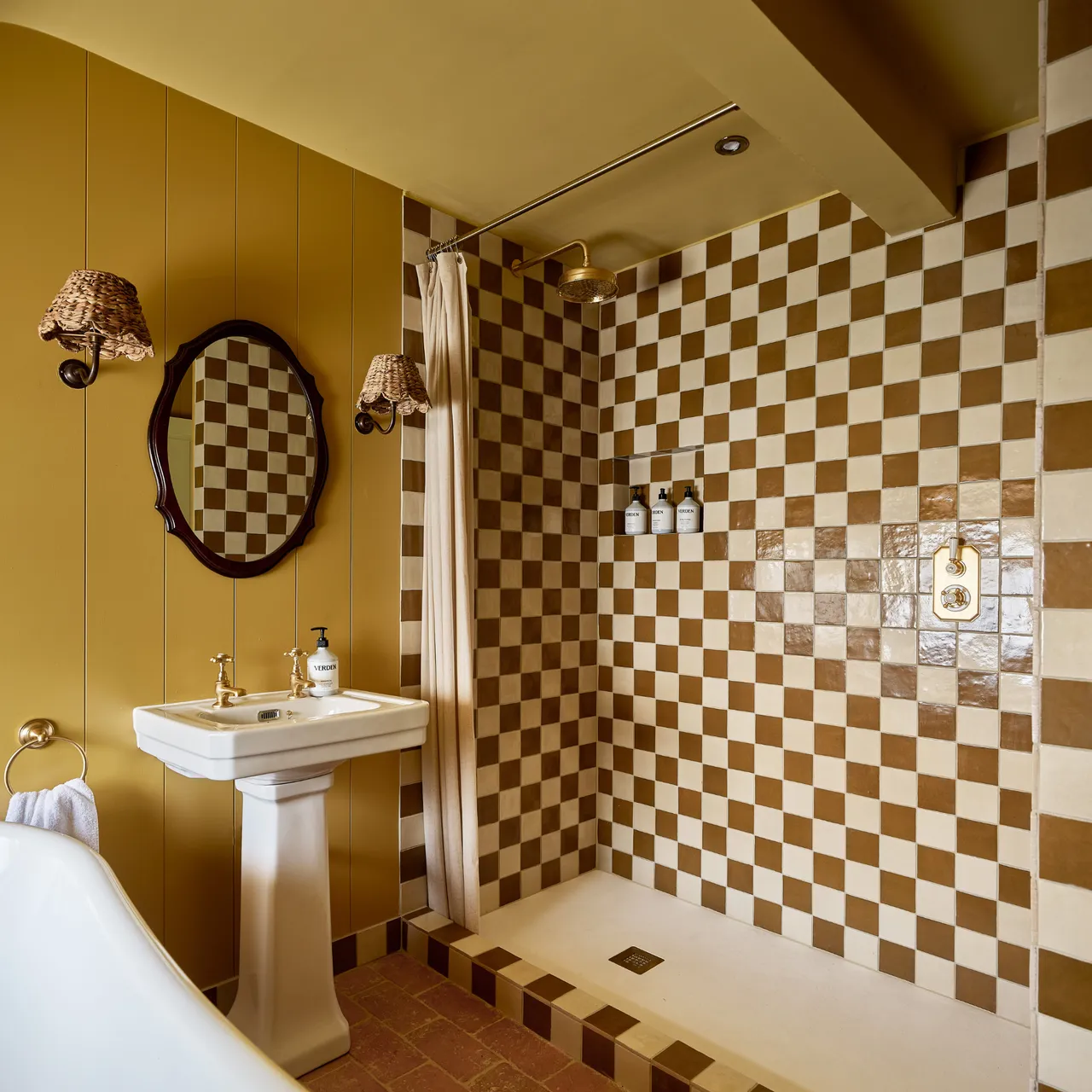
Bathrooms
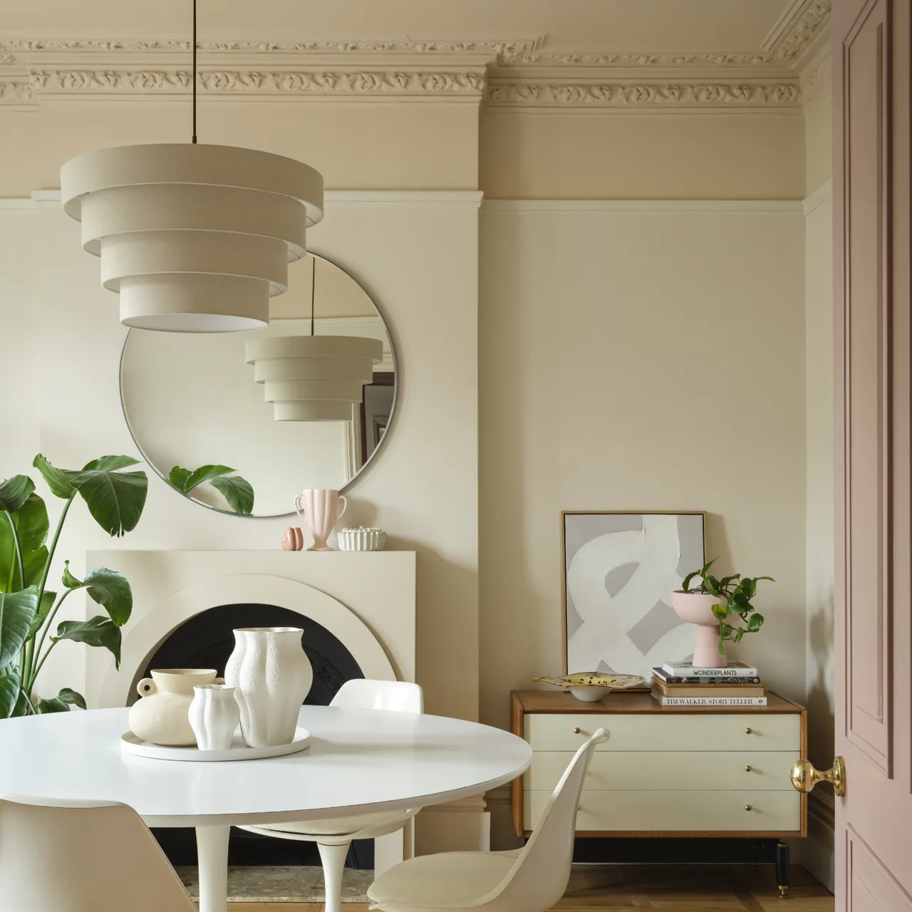
These often small spaces can really pack a decorative punch, proof that size isn’t everything when it comes to style. Colour capping is a brilliant way to make a bold design statement without overwhelming the room. By wrapping the walls and ceiling in the same hue (or tonal variations of it), you instantly add depth, drama, and a sense of intention. It’s the kind of detail that makes guests pause and think, “Something about this just feels right.” Small space, big personality – that’s the power of smart colour play.
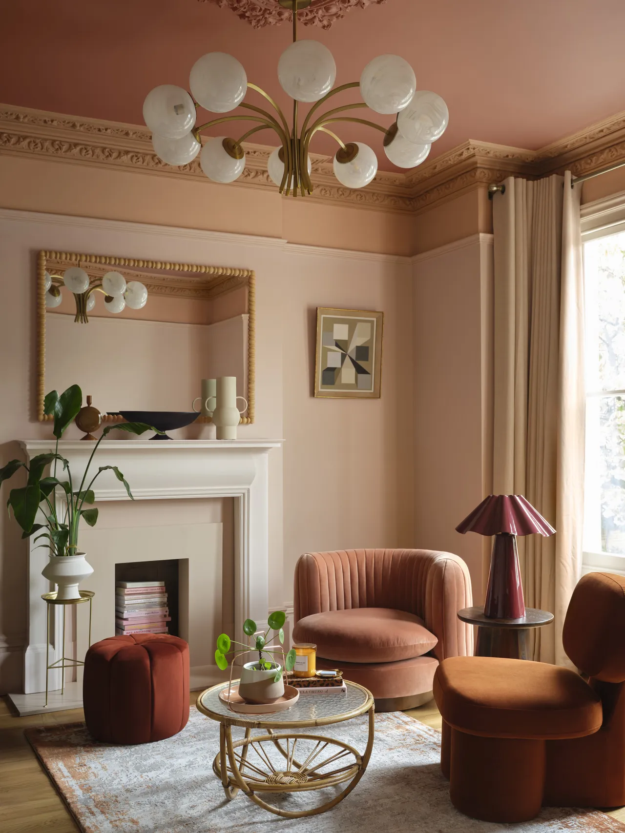
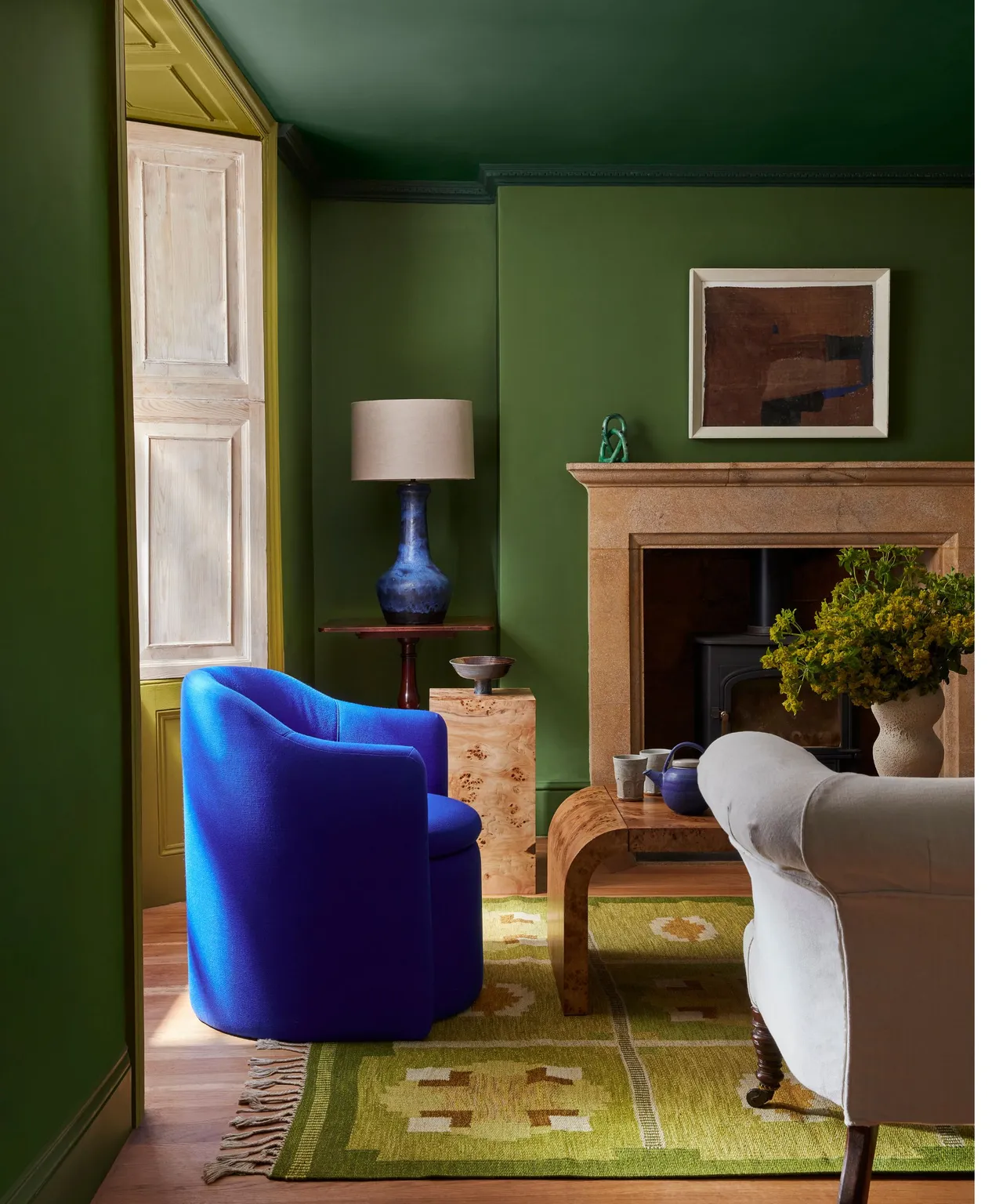
Living rooms
Add instant depth and sophistication to your living room with a touch of colour capping. It’s a clever designer trick that draws the eye upward, blurs boundaries, and makes a space feel beautifully considered. Whether you opt for a deep, moody hue for a touch of drama or a soft neutral for understated elegance, continuing the colour onto the ceiling creates a seamless, cocoon-like flow. It’s proof that sometimes, the most transformative design moves come straight from a paint tin.
Beautiful, But Not for Every Room
We can all agree, turning your ceiling into the ultimate accent wall is seriously tempting. It’s dramatic, it’s stylish, and it whispers “designer touch”. But like any good trend, colour capping isn’t a one-style-fits-all solution. Rooms that lack natural light can sometimes feel a little heavy-handed when drenched in deeper tones, so opt for lighter, more reflective shades to keep things airy and inviting.
Of course, those grand spaces with high ceilings and beautiful mouldings are born for this look; they practically beg for a little colour drama overhead. But what about rooms with lower ceilings? Well, that’s where it gets tricky. Going too dark can make the space feel even more compact, while choosing the right mid-tone can actually create the illusion of intimacy and warmth. It’s all about balance, proportion, and a dash of bravery, because when done right, even the smallest room can wear its colour cap with confidence.
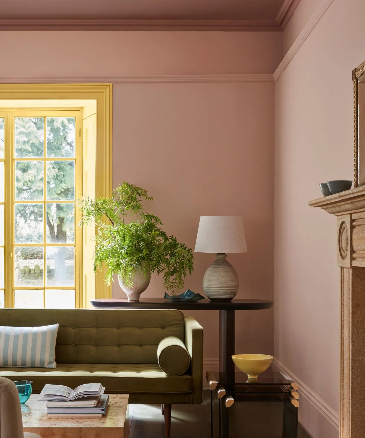
How to Choose the Right Colour
First things first: decide on your tone, literally! Cooler shades often crave a little more light to shine, while warmer hues are far more forgiving, happily thriving in both bright and shadowy rooms. The tone you choose has a remarkable effect on how a space feels; it can completely shift the mood from calm and airy to rich and cocooning.
There are no rigid rules in colour capping (and thank goodness for that), but a few insider tricks go a long way. Darker colours tend to look their best in a satin finish on the ceiling; the gentle sheen catches the light just enough to stop the room from feeling heavy. It’s one of those subtle design details that quietly changes everything.
And don’t forget about your trim! For a smooth, modern wraparound look, stick with the same colour and let it melt seamlessly into the walls. But if you’re in the mood for a little drama, a contrasting trim will add beautiful definition and a touch of designer confidence. After all, a bit of contrast keeps things interesting, just like in life.
Painter’s Tricks Worth Knowing
Preparation
Let’s be honest, one of the main reasons redecorating can feel like a Herculean task (and I know I’m not alone here) is the prep work. The sanding, the taping, the endless touch-ups – it’s hardly the glamorous side of design. But trust me, preparation is everything. Imperfections have to be tackled head-on, especially if you’re venturing into the wonderfully dramatic world of darker tones; those beauties reveal more lumps and bumps than a satin dress.
Precise taping is absolutely non-negotiable. This is where patience pays off; measure twice, paint once, and if you can, invest in a good laser level. The last thing you want is a wonky cap line haunting you from across the room. And while I’m being demanding, yes, that third coat might just be the difference between seamless sophistication and you lying in bed spotting patches you’ll never unsee.
Ceiling Height Adjustments
When it comes to ceiling height, colour really can play tricks on the eye. Lighter tones have a lifting effect, making them perfect for vertically challenged rooms that need a bit of visual breathing space. Darker hues, on the other hand, bring the ceiling down, intentionally, of course, creating a mood that’s cosy, intimate, and deliciously cocooning. It’s all about what you want the room to feel like, not just how you want it to look.
Partial Capping
Now, I’ll admit, I’m a big fan of a bit of partial capping. It’s the understated cousin of the full look but no less stylish. Carrying the wall colour halfway up (or bringing it just a few inches onto the ceiling) adds a subtle, architectural edge that gives the space real character. It’s a clever way to play with proportion, create focus, or simply test the waters before committing to the full wraparound effect. Think of it as colour capping with training wheels, chic ones, of course.
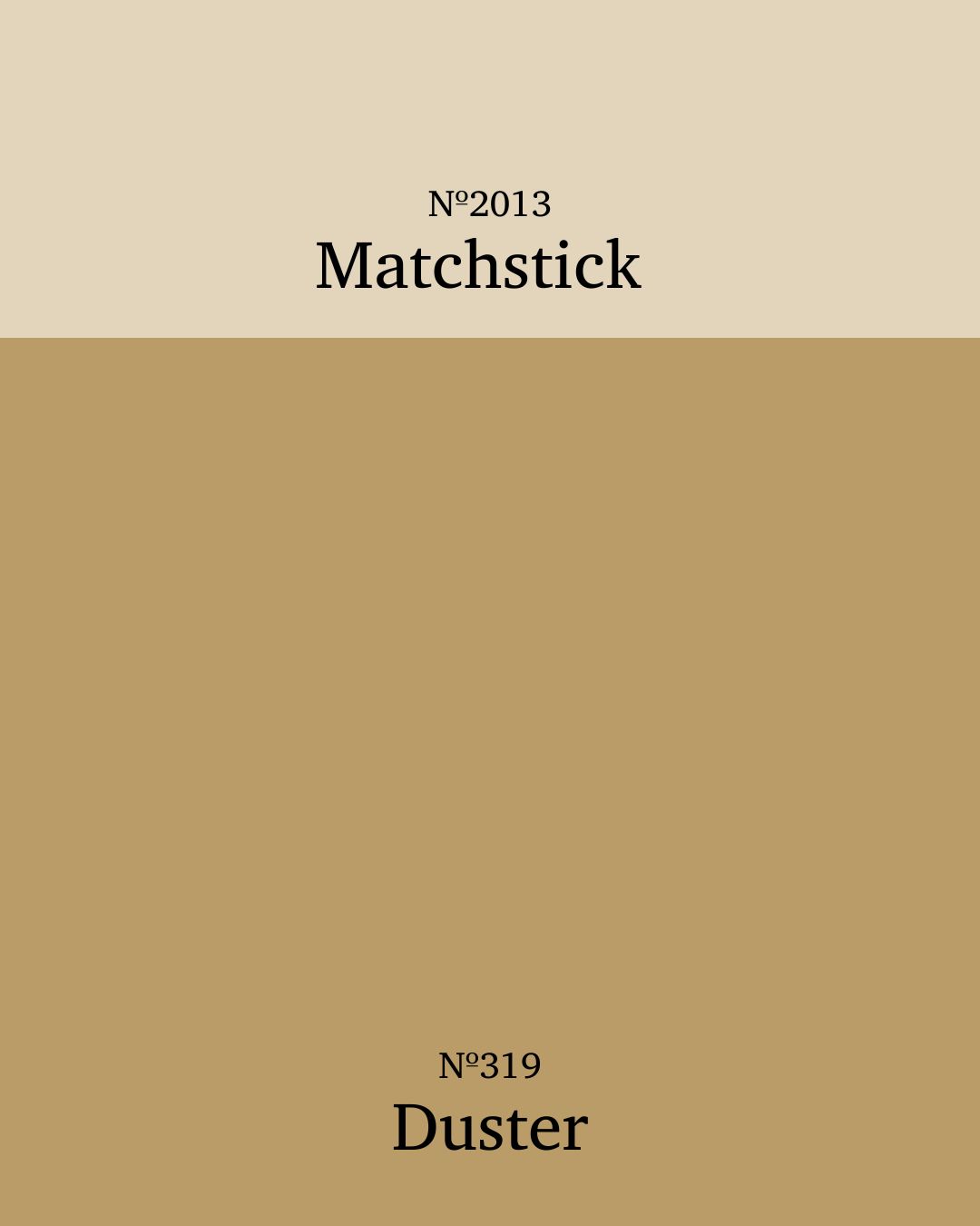
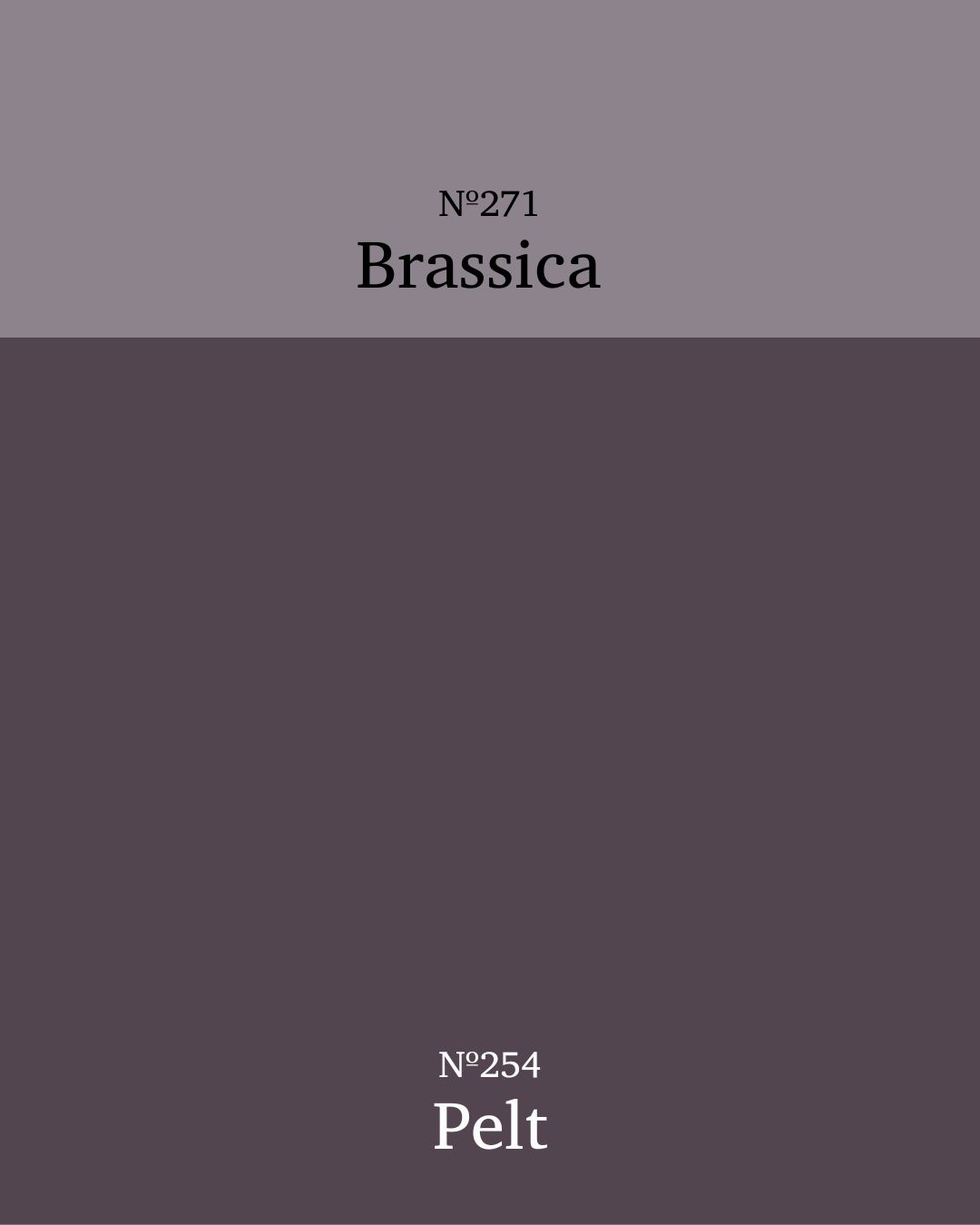
Colour Matches Made in Design Heaven
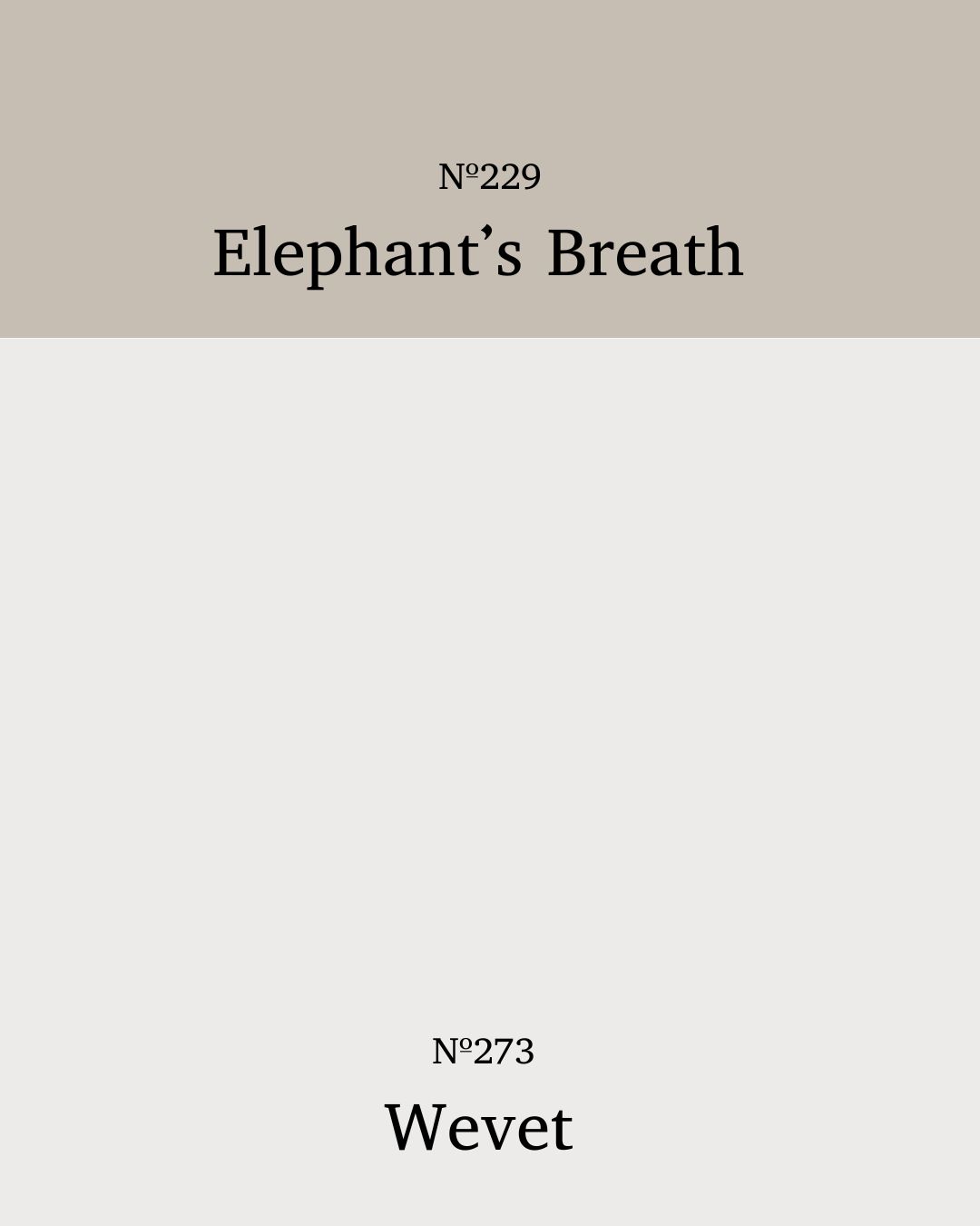
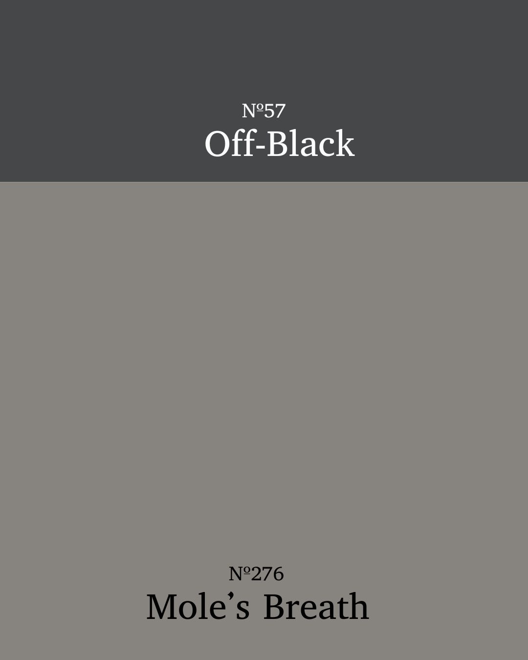
Soft Neutrals
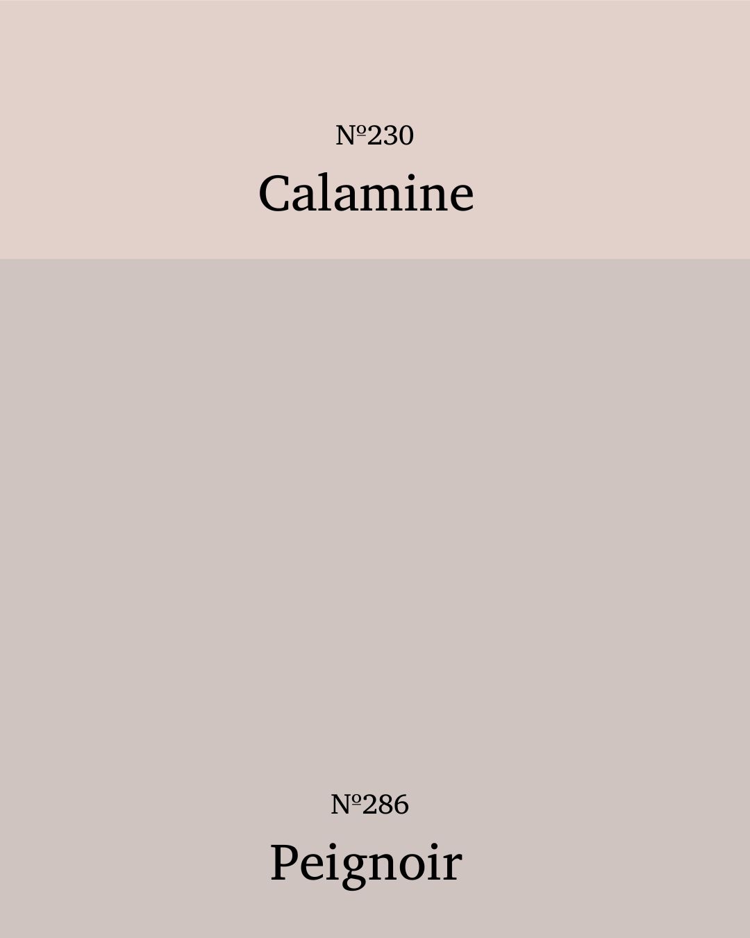
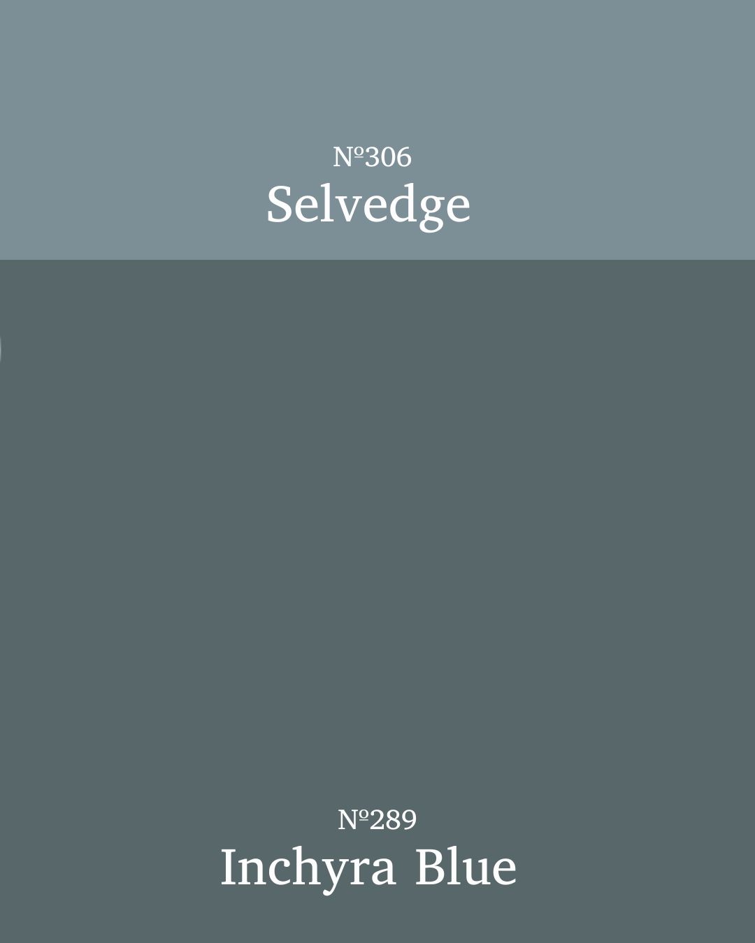
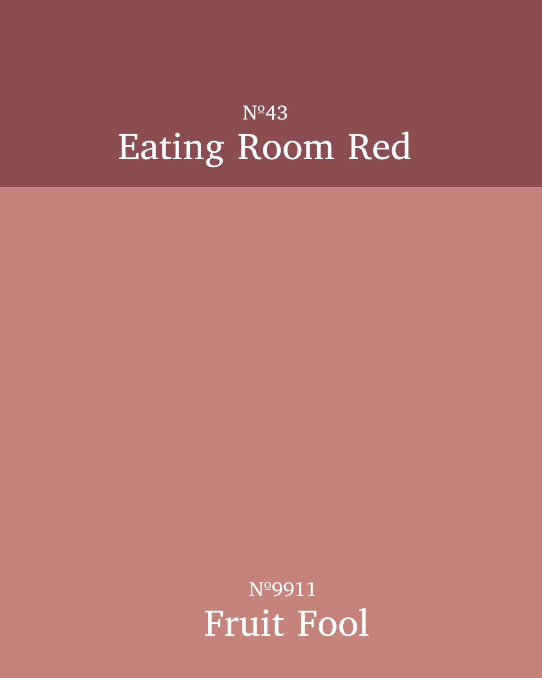
Dramatic Tones
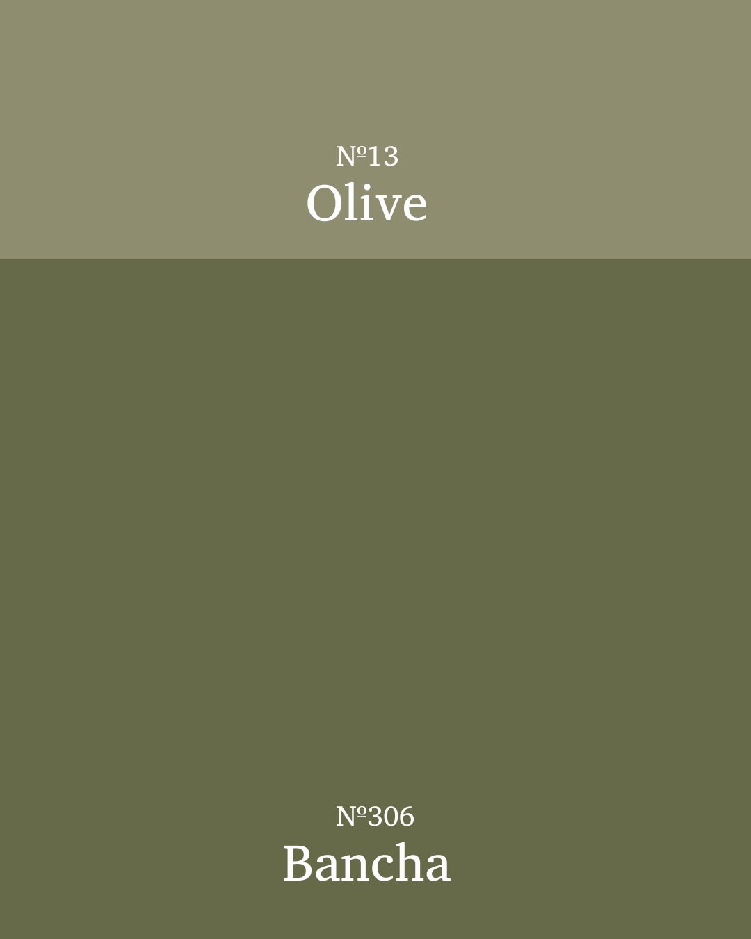
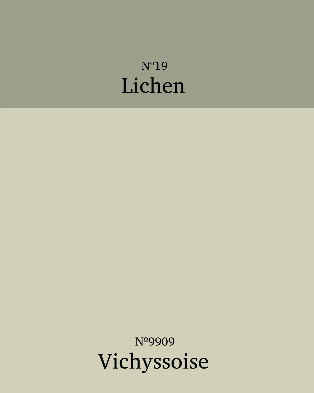
Playful Modern Palettes
Common Mistakes to Avoid
We’ve all been there, fallen head over heels for something in a gorgeous colour online, only for it to arrive and look completely different in real life. Blame it on lighting, not your impeccable taste! Natural light, artificial light, north-facing, south-facing – every condition changes how a colour behaves. Always, always test generous patches on your walls and watch them throughout the day. Morning light, evening glow, lamp-lit night; you’ll be amazed at how much a hue can shift its personality.
And while I’m on my soapbox, prep those walls like your design reputation depends on it (because, frankly, it does). I’ve said it before, and I’ll say it again: priming and perfecting your surface is everything. Even lighter shades will expose every tiny imperfection, so just imagine what a moody, dramatic tone will do. The only shadows you want in your room are the intentional, atmospheric kind, not the ones caused by bumpy plaster and wishful thinking.
Final Thoughts
In all honesty, colour capping isn’t just another fleeting trend; it’s a timeless design technique that’s all about creating balance, atmosphere, and a touch of visual magic. Think of it as a clever little paint trick that can make a room feel taller, cosier, or just plain fabulous, depending on how you use it.
If you’re tempted to give it a go, start small; perhaps in a guest room, hallway, or any space where you’re happy to experiment. After all, this technique is designed to play with perception and mood, and it’s surprisingly forgiving once you find your rhythm.
So, ready to transform your space? Grab a brush and try a bit of colour capping. You’ll be amazed how a few well-placed strokes of paint can completely reshape not just your walls, but the entire feel of your home.