
Hero prints are an excellent base for any new design project. Just like Bonnie Tyler, we’re all holding out for a hero, but in the world of interior design, our hero doesn’t need to be “fresh from the fight.” It just needs to be the bold, unapologetic pattern that anchors your entire room.
It’s easy to feel overwhelmed or stuck when designing a room from scratch, which is precisely why you need a hero to save the day. The most beautiful spaces don’t happen by accident; they have a lead character. A hero print is a dominant pattern that dictates the color palette and mood of the entire room. By establishing this focal point early on, you give the eye a place to land, helping you avoid a space that feels either cluttered or, dare we say it, flat.
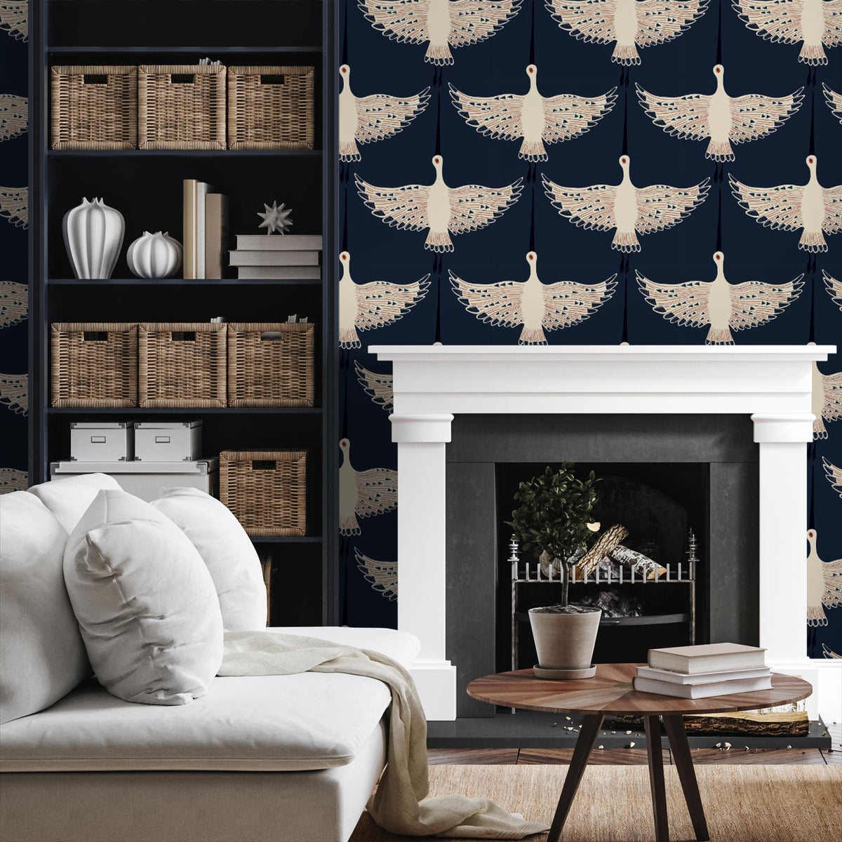
Table of Contents
Finding Your Hero Prints: A Guide to the Leading Character
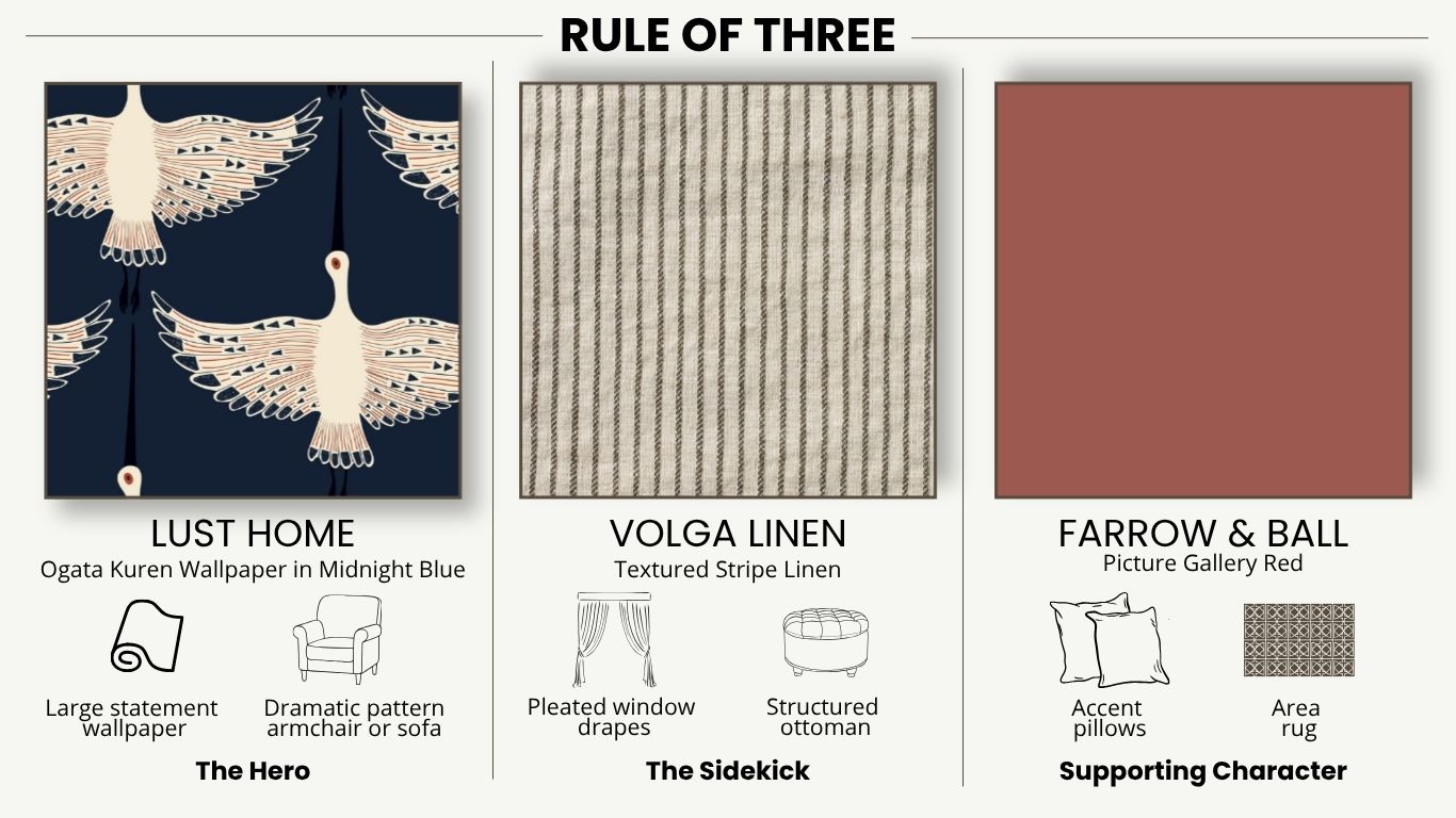
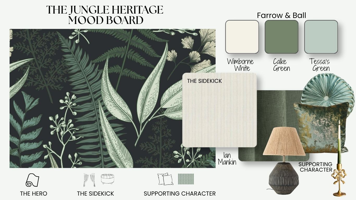
The Rule of Three
To give your hero print that true ‘leading role’ energy, you need to follow the rule of three.
First, commit to your hero, whether it’s a sprawling botanical, a sharp geometric, or a bold stripe. This choice becomes the compass for your entire room. Once your hero is set, step two is all about scale: choose a secondary pattern that is significantly smaller so it supports the hero rather than competing with it. Finally, tie the room together by pulling specific hues from your lead print to use as solid, bold color accents in your styling. Remember, the hero sets the tone, but the scale and accents make the masterpiece.
The Art of the “Color Extraction”
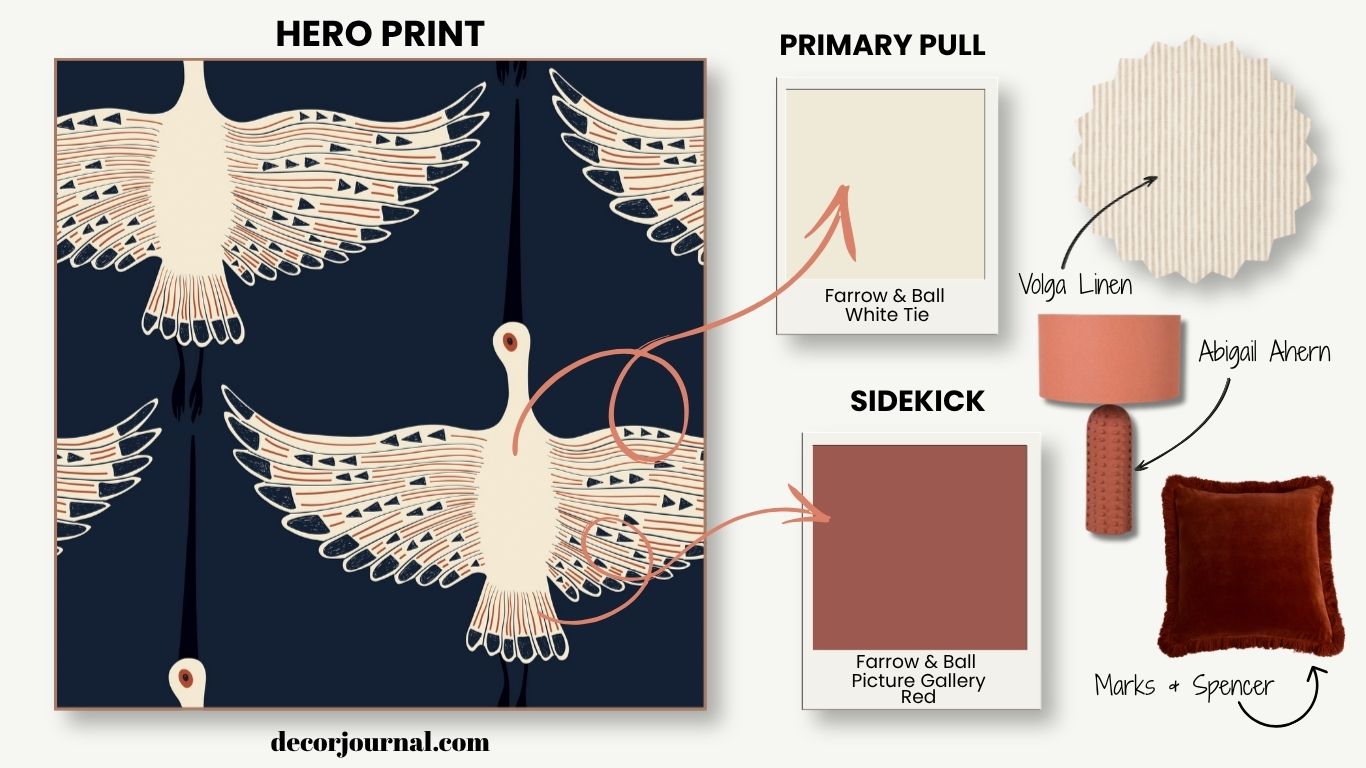
Once you’ve found and fallen head over heels for your hero print, it’s time to start pulling its palette apart to build your room. This “color extraction” is the secret to that elusive, cohesive look professional designers nail every time.
The primary pull start is by looking at the background color of your hero. This is almost always your safest and most sophisticated choice for wall paint or floor-to-ceiling drapes. It sets the stage without competing for the spotlight.
The detective work Next, it’s time to get the magnifying glass out. Look for the “blink-and-you’ll-miss-it” shades, the tiny flecks in a flower’s center or the subtle line in a geometric weave. These are your sidekick colors. They are perfect for your secondary layers: pillows, vases, lamp bases, and frames.
The Vibe Check Finally, consider the atmosphere. Does your print feel cool and airy or dark and moody? Let that overall energy dictate your finishes. A moody hero print might call for the depth of a matte wall, while an airy floral might be elevated by the “sheen” of brass accents or glazed ceramics.
The Battle of the Heroes
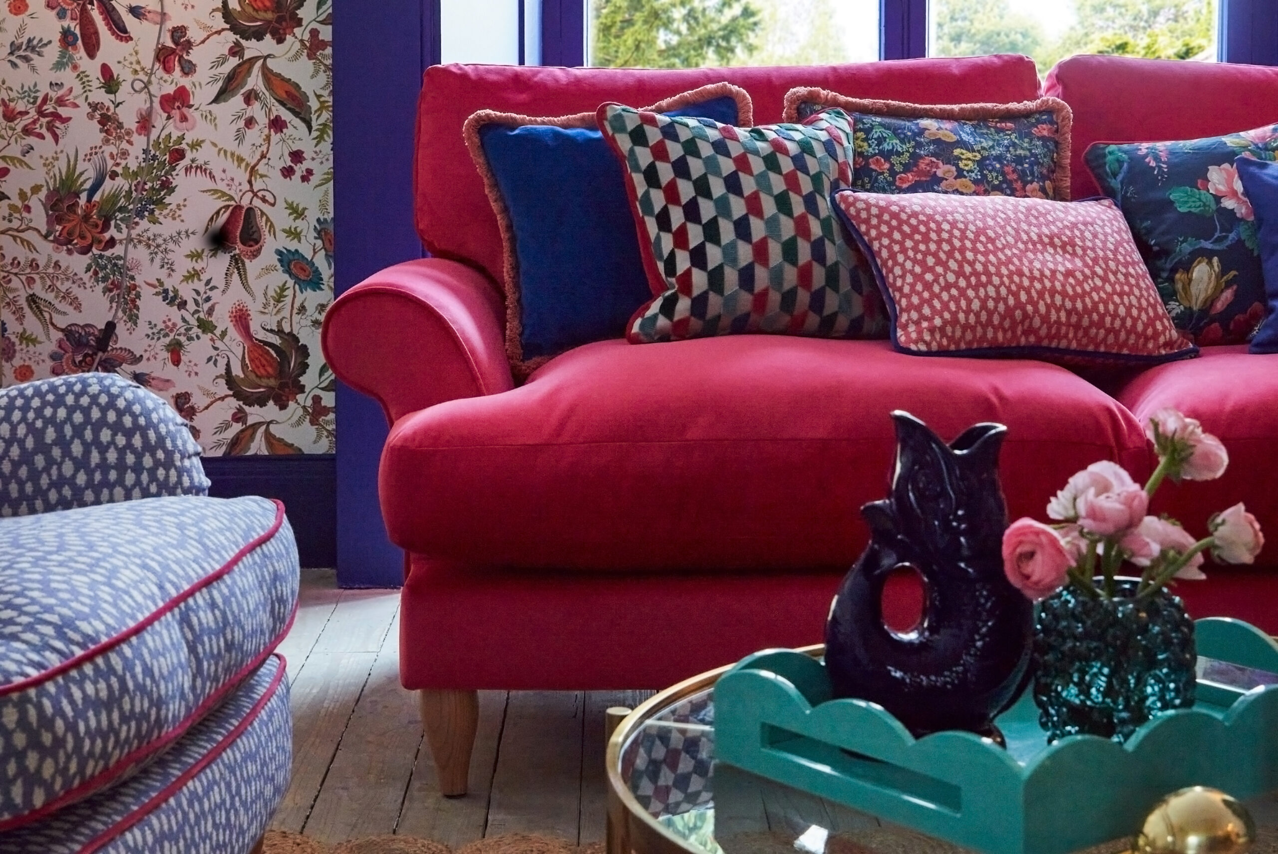
As the saying goes, “If everyone is shouting, nobody’s heard.” The same applies to your decor. While it’s tempting to pack a room with every pattern you love, having two “Heroes” in one space often leads to visual chaos.
Think of it like a movie: you can’t have two lead actors fighting for the exact same spotlight, or the plot gets messy. Unless you are a seasoned maximalist who knows how to balance high-octane drama, stick to one hero. Let it be the star, and let your secondary and supporting pieces be the “best supporting actors” that help it shine.
The Rule of Thumb: If you have a bold, large-scale wallpaper (Hero 1), don’t pair it with a bold, large-scale rug (Hero 2). Pick one to be the focal point and let the other be a textured solid or a subtle, small-scale print.
Hero Prints in Action: How to Style a Statement Wall
While a bold, modern wallpaper isn’t always the most economical route, it is undoubtedly one of the most striking. In this scenario, your walls define the room’s entire identity. Because this is your hero print, you’ll want to lean heavily on the Rule of Three: extract your accent colours directly from the pattern to create a cohesive thread. To maintain visual balance and harmony, keep your larger ‘anchor’ pieces, like sofas and armchairs, neutral. By giving the furniture a quiet, supporting role, you allow the walls to do the talking.
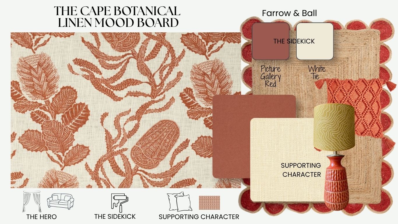
The Heirloom Aesthetic: Timeless Linen as Your Lead Character
While high-end printed linen is undoubtedly an investment, it is a choice that pays dividends in atmosphere. Linen is a beautiful, heavyweight fabric with a unique, organic texture that handles bold hero prints with a grace other materials can’t match. It offers a softer, more lived-in elegance that feels “established” rather than “decorated”.
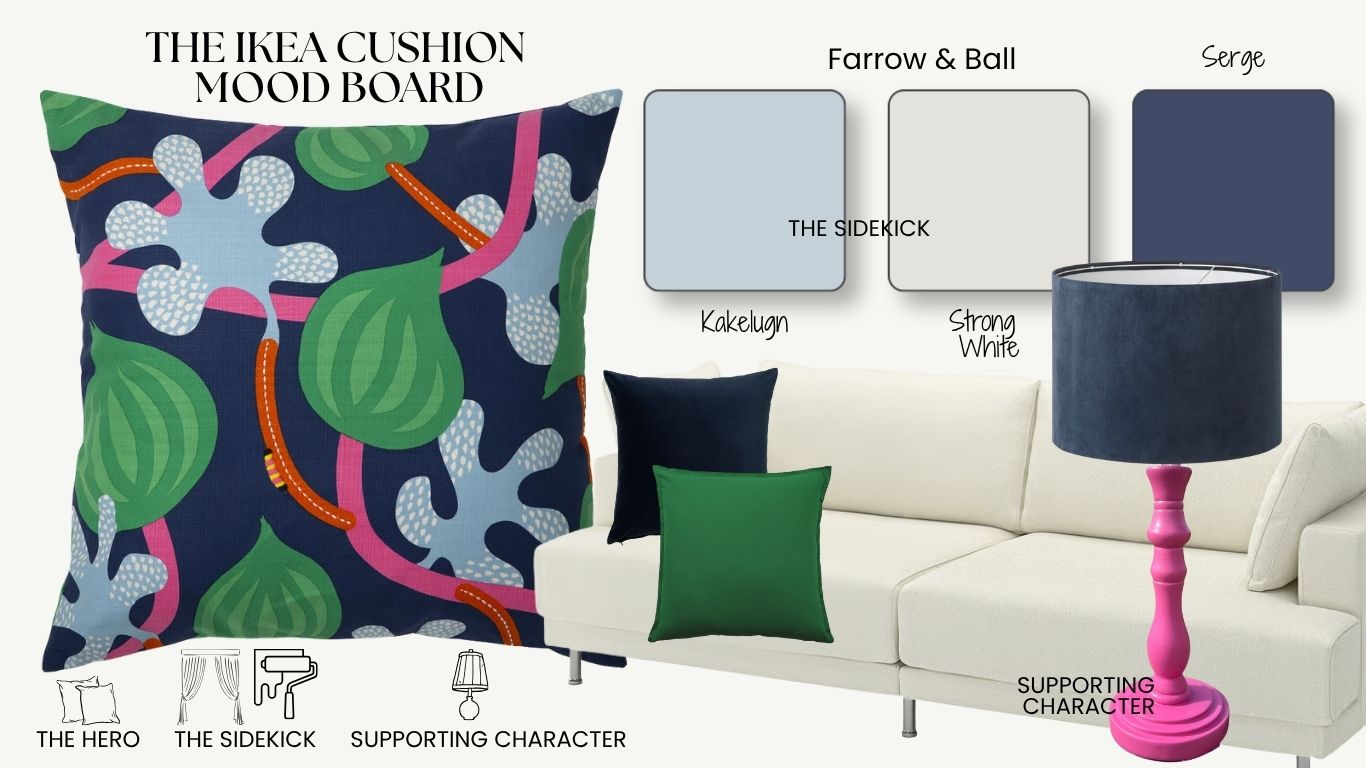
The Savvy Refresh: Giving Your Budget Pieces a Lead Role
You don’t need a massive renovation budget to showcase a hero print. Often, the most economical way to transform a room is through simple, high-impact textiles like cushions or throws. By treating a budget-friendly find, like a bold IKEA or H&M Home print, as your lead character, you can redefine a space for the cost of a weekend lunch.
The Styling Tip: Elevate with High-End Colour
The secret to making affordable textiles look like a luxury investment lies in the backdrop.
- The Primary Pull: Keep your main furniture pieces in lighter, neutral tones to provide “visual silence”, then use a high-end paint colour on your walls to immediately “elevate” the cheaper fabrics.
- The 3D Effect: Lean into the Rule of Three by pulling specific accent colours from your hero print and applying them to lamps, picture frames, or even the woodwork.
- The Result: This coordinated “colour drenching” of small details creates a sophisticated, curated 3D effect that makes a budget-friendly room feel custom-designed.
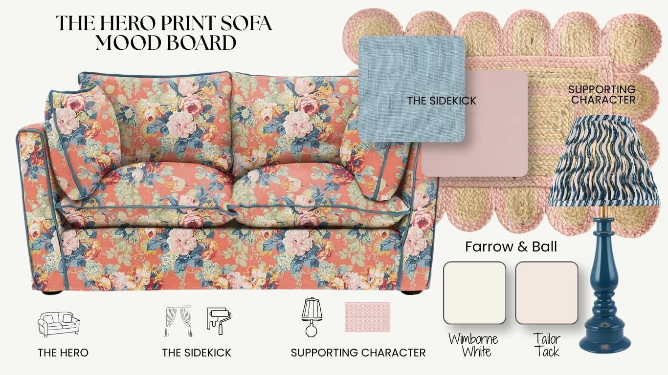
The Anchor Piece: Making Your Sofa the Star of the Show
When you choose to make the largest piece of furniture the star, you are creating a bold “anchor piece” that defines the entire room’s personality. This approach requires a bit of restraint elsewhere to ensure the upholstery remains the lead character. The secret to making this look work is the use of “quiet” rugs and minimal art, which provides the necessary “visual silence” to keep the focus firmly on the sofa’s print. By grounding the space with neutral, textured elements, you allow your Hero Print to command the room without creating a sense of visual clutte
Where to Shop Hero Prints
Finding the right hero print is about balancing your personal style with your project’s budget. To help you navigate the vast world of textiles and wallcoverings, I’ve categorised my top industry picks into three distinct tiers. Whether you are looking for a heritage investment piece from icons like Volga Linen or Morris & Co., seeking the bold, maximalist energy of trendsetters like House of Hackney, or hunting for a budget-friendly refresh via IKEA or H&M Home, there is a perfect lead character waiting for every room. By choosing a brand that aligns with your vision, you ensure that your “star” piece not only looks beautiful but also feels authentic to your home.
The Investment: Volga Linen, Morris & Co, Liberty London, Sophie Conran.
The Trendsetter: Lust Home, House of Hackney, Ottoline.
The Budget-Friendly: Wallpaper Direct, H&M Home Ikeas Etsy (for custom cushions).
Conclusion: Finding Your Lead Character
Mastering the Hero Print isn’t about following a rigid set of rules; it’s about understanding the hierarchy of a room. By identifying your lead character, whether it’s a moody jungle heritage wallpaper, a timeless Volga linen, or a vibrant IKEA cushion, you create a roadmap for the rest of your design. Remember to use the sidekick to provide a change in scale and let your supporting characters provide the tactile, 3D depth that makes a house feel like a home.