
Picking the best paint colors for your home can feel confusing. You might worry about choosing shades that look bad or do not match your furniture. Many people feel overwhelmed, staring at tiny color samples, and still end up unhappy with their choice.
Color can change how a room feels. Studies show that even lighting in your space can make one color look different throughout the day.
This guide will help you find easy steps to pick the perfect paint colors. I’ll share tips on matching colors with your decor, testing samples first, and avoiding common mistakes.
Start exploring how to bring new life to every room!
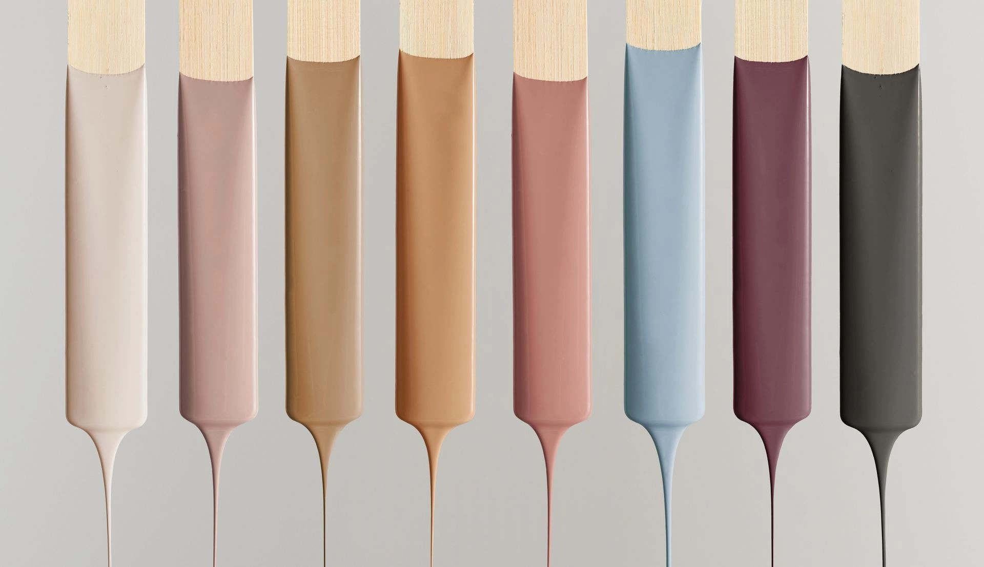
Table of Contents
Understanding the Basics of Paint Colors
Every room reacts to color in its own way, based on light and surroundings. Picking the right shades can change how a space feels: warm, cool, calm, or bold.
How lighting affects color perception
Natural light changes the look of paint throughout the day. Morning sun might make wall finishes appear cooler and softer. Afternoon light, especially in west-facing rooms, can add warmth and brightness to shades and tones on your walls.
In spaces with little daylight, artificial lighting becomes key. Different bulbs create different moods; LEDs often give a crisp glow, while incandescent lights cast a yellow tone that can change color perception.
Colors seem to shift as the sun moves or as you flip on a lamp, say many interior design experts.
Paint trends show that soft grays or pastels may feel completely different under warm versus cool bulbs. Choosing the right color palette means thinking about both natural light and lamps in each room.
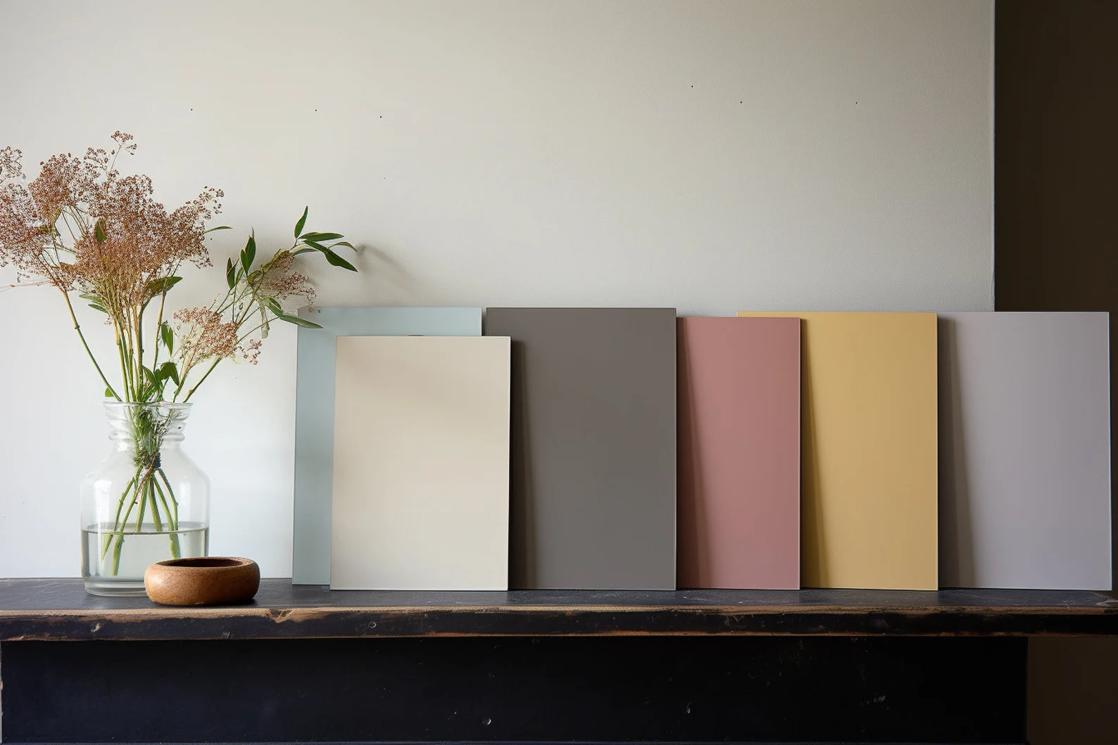
Sample panels next to windows and under ceiling lights help with smart color selection for your home decor plans. Be patient at this stage; the longer you have a sample in the room, the more you’ll see how the color behaves in different lights.
The role of color psychology in home design
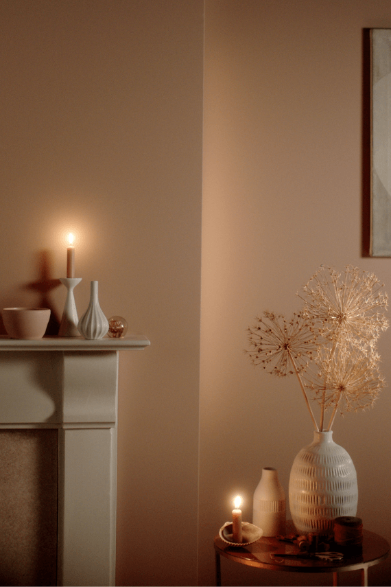
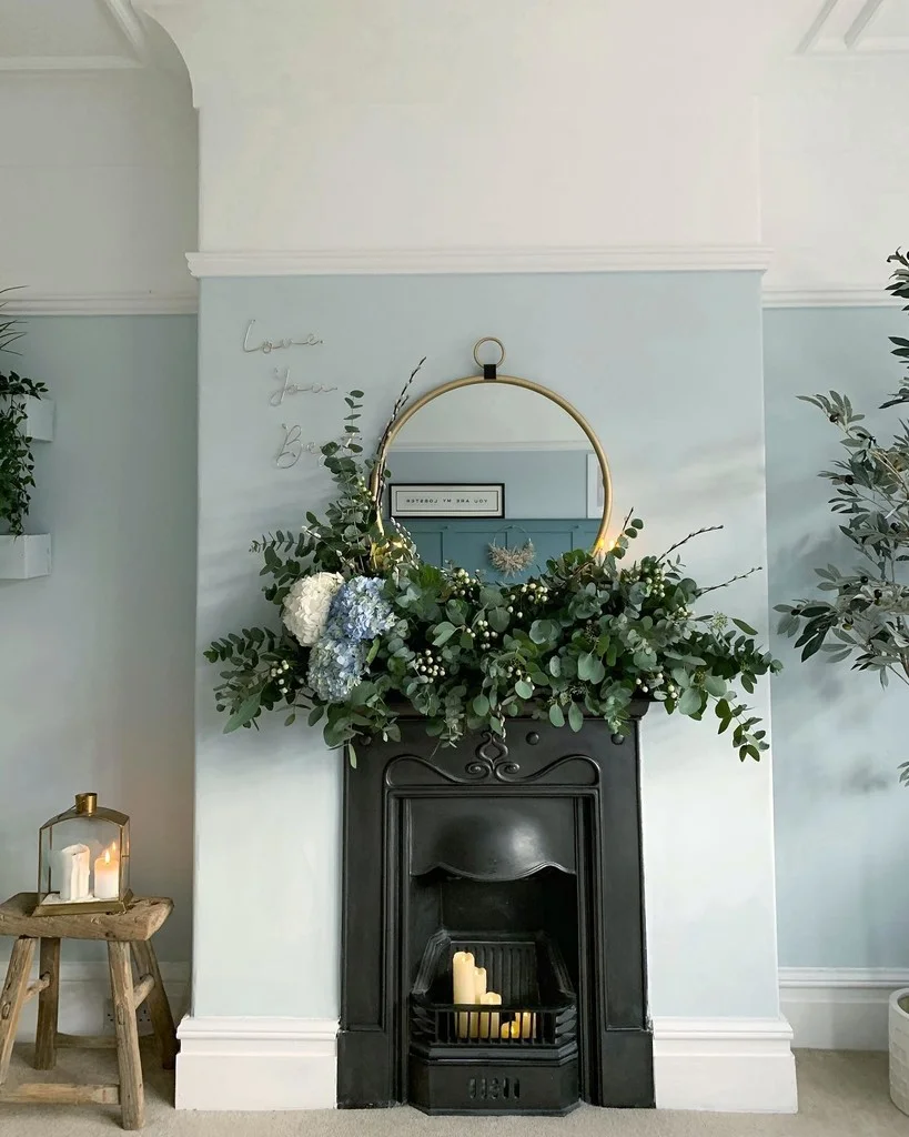
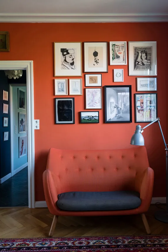
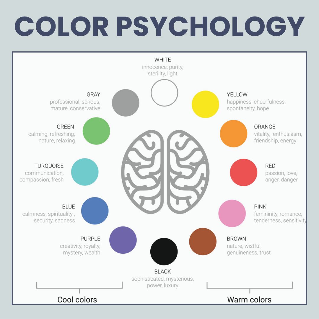
Colors can change how we feel. Warm colors like red or orange often make us feel excited and lively. They are great for social areas, like the living room, dining room or kitchen. Cool colors, such as blue and green, help create calmness. These shades work well in bedrooms and bathrooms or places where you want to relax.
Color psychology affects our mood and behavior at home. Choosing the right paint colors can set the tone of each room. For example, a bright yellow kitchen feels cheerful and inviting.
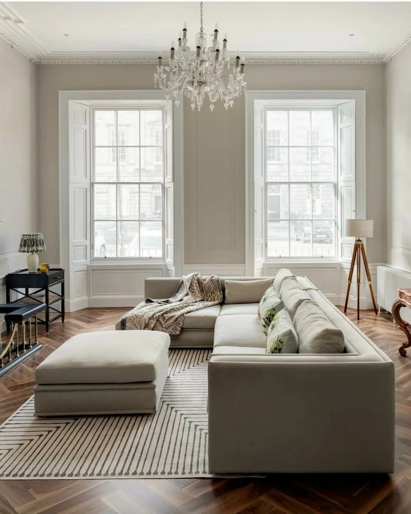
A soft gray living room brings peace and comfort. Keeping these feelings in mind helps choose a color palette that fits your home’s style perfectly. Next up is matching colors to your furniture and decor!
Tips for Choosing the Perfect Paint Colors
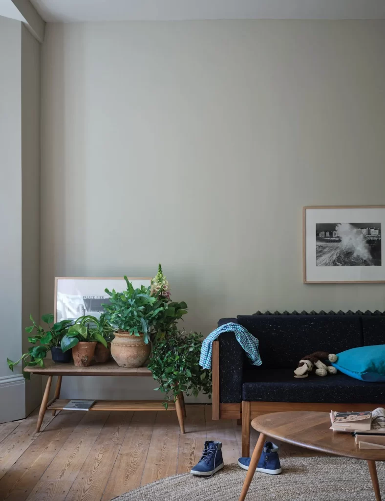
Choosing paint colors can be fun but also tricky. Consider your furniture and decor before picking shades; you want them to match, not clash! Testing small samples on the wall is a smart move too. It’s really important to consider how a room will be used before we make a decision.
This way, you see how they look in different lights before making a choice.
Matching colors to your furniture and decor
Colors can change a room’s feel. Look at your furniture and decor before picking paint. Soft colors can pair well with dark furniture, while bold hues may pop against lighter pieces.
Test shades on the wall next to your items. This helps you see how they match in different lighting situations.
Consider the mood you want across different areas too. A calm blue might work wonders in a bedroom, but it could clash with bright red accents elsewhere. Use color palettes that complement your decor style for better results.
Mixing warm and cool tones can create balance and harmony throughout your home décor.
Testing paint samples before committing
Moving from matching colors to your furniture and decor, testing paint samples is key. Grab some small cans of paint in the shades you like. Paint a few swatches on your walls. Look at them throughout the day. Lighting will change how they look.
Each color can seem different depending on the light in your room and what’s around it. Keep these factors in mind as you check out different hues for your home decor. A shade that appears perfect one moment may feel off later on, so take your time! Testing helps make sure you’re satisfied with your choice before making a big commitment to painting an entire wall or room.
Common Mistakes to Avoid When Selecting Paint Colors
Choosing paint colors can be tricky. One common mistake is not testing out the colors first. Some people pick a shade from a tiny swatch and think it will look great on their whole wall. But light changes how we see color, so always try samples on your walls before deciding.
Another error is ignoring how your furniture looks with the new paint. You want the colors to match or complement each other, right? If you have bright decor, muted tones might work better than bold shades.
Finally, people often forget about undertones in paint colors. A cool blue may clash with warm furniture if you’re not careful. Stay mindful of these mistakes for better choices in home decor and design inspiration! Next up: some tips for choosing the perfect paint colors!
Tips
Start with the Mood
Decide how you want the room to feel. Cozy and cocooning; try warm neutrals or deep jewel tones. Airy and fresh; opt for soft pastels or crisp whites.
Look at the Light
Natural light changes everything. North-facing rooms love warmer shades to counter cool light, while south-facing rooms can handle cooler or bolder tones. Always test colors at different times of day.
Test, Test, Test!
Never trust a tiny swatch. Paint large samples directly on the wall or use peel-and-stick samples so you can see how the color behaves in your space.
Work with What You Have
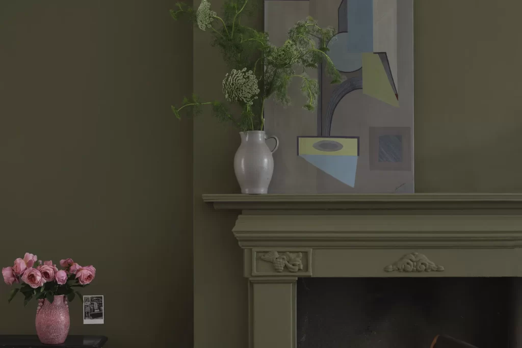
Take cues from existing furniture, flooring, and textiles. A paint color should complement, not fight with, your sofa, rug, or cabinets.
Think Flow, Not Just One Room
Consider how colors connect from room to room. A cohesive palette creates harmony, while subtle contrasts keep things interesting.
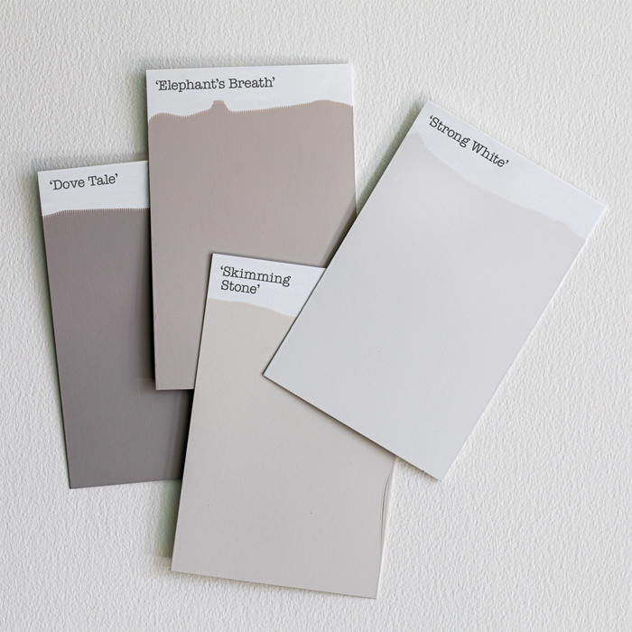
Play with Undertones
Whites, greys, and neutrals aren’t as simple as they seem; undertones can make them lean warm (yellow, beige) or cool (blue, green). Compare side by side before committing.
Consider the Ceiling & Trim
Don’t ignore the “fifth wall.” Crisp white ceilings can open up a space, but painting them the same color as the walls creates a modern, cocooning effect. Trim can be tonal for subtlety or bold for drama.
Test with Furnishings & Decor
Place paint swatches behind your headboard, near art, or beside cabinets so you can see how the color works with your real-life setup.
Don’t Fear Bold Colors
Small rooms can handle dark or bright shades. A jewel-toned powder room or deep navy study can feel luxurious, not claustrophobic.
Trust Your Gut (and Have Fun!)
Paint is one of the easiest, most affordable design changes you can make. If you love a color, go for it; you can always repaint later.
Conclusion
Getting the right paint color makes a big difference in any home. Bright, calm, or cozy shades shape how your rooms feel.
Cover key tips by checking natural light, testing samples, and matching colors to decor. These will help you avoid common mistakes like picking colors too quickly or ignoring room size.
Paint science shows that both lighting and surface texture change how we see shade or tone, so small sample tests are very important.
Safety matters too; always pick paints with low VOCs for better air quality at home. Stick to brands that follow industry rules and display certifications clearly on their labels. Honest info about ingredients protects families, and honesty builds trust between homeowners and paint sellers.
To use this guide best at home, try taking small steps first; tape up samples next to major furniture pieces before painting full walls. Think about the mood you want for each space; brighter rooms may work well with cooler tones, while bedrooms might need warmer hues.
Using this ultimate guide offers more benefits than just following social media trends or shopping by “trending” swatches alone; it encourages real-life testing in your space so results match what you expect later on your walls at different times of day.
On the plus side, this approach saves time by reducing repaints; it also helps you find colors you enjoy longer instead of getting bored fast with passing fads. Some may find there are so many choices it feels hard to decide; they should focus on one room first if feeling unsure compared to other guides, which skip steps like checking under different lights.
I highly recommend this method for all types of homes, from city apartments to large family houses, as it blends expert insight with hands-on trial-and-error that everyone can do themselves without extra cost or stress.
So before you pick up your paintbrush, be sure to read This Ultimate Guide To Finding Perfect Paint Colors thoroughly, especially for those wanting fresh ideas grounded in proven design methods instead of risky guesses or guesswork inspired by short-lived trends.